Introduction
In the data-driven world of today, every bit of information has the capacity to reveal important new information. Staying competitive requires the ability to crunch the data on everything from corporate choices to market trends. Come along with us for a captivating adventure as we explore the fascinating process of turning raw data into meaningful and practical insights, all thanks to the remarkable capabilities of Tableau.
We’ll go into the realm of data analysis in this blog, with a particular emphasis on our examination of US retail data from the « Sample – Superstore » dataset. Through the use of our Tableau dashboard, you can uncover patterns, trends, and opportunities that could have remained hidden and gain insight into the secret tales hiding beneath the numbers.
This blog aims to demystify data analysis, present our findings, and encourage readers to start their own data exploration journeys—whether they are business professionals, data enthusiasts, or just inquisitive about the magic that occurs behind the scenes. So buckle in, and let’s set out on this data-driven journey together.
Dashboard1: U.S Sales Overview
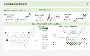
Let’s kick off our data journey by delving into an overview of key performance indicators (KPIs) that drive the success of any business: sales, profits, and quantity. But we won’t just stop at that. We’ll take you on a visual expedition through Sparkline, revealing how these KPIs performed not only in the Current year (2022 in our data set which is the last year of collecting data) but also to draw insightful comparisons and the with the preceding year 2021, and how they’ve changed year over year
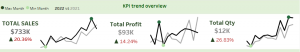 Fig1.1: KPIs Trend Overview
First on our KPI agenda is the lifeblood of any business: sales.
As the calendar turns to 2022, the financial landscape of our business takes a promising turn. For 2022, an impressive total sales figure of $733,000, had achieved indicating a significant increase from the previous year. What’s even more exciting is the strong Year-over-Year (YoY) growth rate of 20.4%, which has taken our business to new levels of success.
Our sales Sparkline showcases a remarkable upward trajectory, indicating consistent growth over the years.
While the CY has showcased strong and consistent growth, May stands out as an exception. In May of the PY, sales peaked at $57,000, surpassing the $45,000 in sales we observed in the CY. This divergence highlights a unique pattern, and we’ll delve deeper into what might have caused this temporary setback and how it fits into the broader growth trend.
Maybe that’s because in May 2022, the financial markets have exhibited higher than usual price volatility thus far in 2022.
In the U.S., November includes Thanksgiving, a holiday associated with feasting and shopping. The day after Thanksgiving, known as Black Friday, is a major shopping event with significant discounts. This holiday and the related shopping promotions can boost sales in November. On the other hand, February may not be a peak month for certain items. In February, consumers may be more focused on managing their budgets and addressing increased heating expenses, which can lead to a temporary reduction in online shopping activity. Severe weather conditions in some areas can still impact online shopping, causing delivery delays and discouraging customers from making purchases.
Next in line is profits – the ultimate measure of a business’s financial health. A $96K total profit is made up to 2022, with a 16% increase YoY. With our Sparkline chart the max profit is achieved in March, this month might experience higher demand for certain products or services. This could be due to the changing of seasons, the approach of spring. And the min is for April. In the U.S., tax season typically occurs in April. Consumers may have financial priorities in April, such as filing taxes and managing tax refunds, which can influence their spending habits. This might lead to decreased consumer spending on non-essential items.
Last but not least, quantity – a crucial KPI that reveals the volume of goods or services your business moves. We’d explored the quantity sold in 2022, as it aligns with sales and how it fares in comparison to 2021.
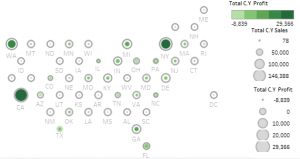 fig1.2:Sales & Profits Distribution by States
Our second stop takes us to the heart of the United States, where states become pixels, and sales and profits transform into vibrant colors on our hex map.
Hex Mapping: Sounds intriguing, doesn’t it? Well, it’s more than just a captivating visual—it’s a portal to understanding how our business thrives across the nation. With every hexagon representing a state, we’ve translated complex data into a format that’s not only beautiful but highly informative.
Within each circle, a spectrum of colors emerges to symbolize the sales performance of each state. Darker shades catch your eye, indicating the states with the highest sales figures. It’s an immediate, visual feast, allowing us to spot the star performers in our great American ensemble.
But there’s more to this visual tale. Surrounding each state’s sales circle is a ring that reflects profitability. The wider the ring, the higher the profits. The most profitable states stand out, each a beacon of opportunity.
California: The Star of Sales and Profits
On our circular map, California is the superstar. It’s clear to see – California is the rich, dark green circle that stands out. It’s the top performer in both sales and profits.
Texas: The Sales Puzzle
Texas is a sales powerhouse, with strong demand for our products. It stands out on our map with its deep green color, showing big sales.
But there’s a twist. Despite the high sales, Texas doesn’t make a profit (a negative profit). It’s a bit of a mystery, and it tells us that business is more than just making sales.
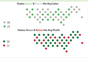 fig1.3:States above & Below the Average
Our journey into the colorful world of data doesn’t stop at the captivating hex map. Alongside this visual masterpiece, we’ve introduced two additional plots that shed light on the performance of states in relation to the average.
States Above /Below Average Sales and States Above/ Below Profit
Some states (19 state) are soaring high above the average in sales. They’re in a league of their own, showing strong demand for the available products. Some of those states: California, Nevada, Maryland, Michigan…
On the flip side, some states (38 state) are below the average. They’re working hard to catch up. They might have hidden potential or unique challenges.
States like New Mexico, Texas, New Jersey, and Colorado might have below-average sales due to varying market sizes, high competition, local economic conditions, or initial market entry challenges.
This dual view gives us a clear picture of how different states are performing.
We’re also looking at our profits in addition to sales. It’s not just about what we sell; it’s also about how much money each state brings in. This parallel analysis helps us understand the financial aspect of our business across states.
Dashboard2: Regional Sales Profitability
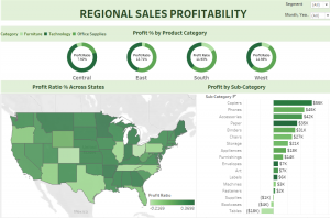
Welcome to the « Regional Sales Profitability » dashboard, a hub of insights that casts a spotlight on the performance of different regions in our business landscape.
 fig2.1: Profit Ratio by Product Category
As you gaze at these donut charts, each one dedicated to a specific region, you’ll quickly notice that they’re divided into colorful slices. Each slice represents a product category. The size of the slice tells us how much profit that category contributes to the region’s overall profitability.
The West region’s (California/ Washington…) profit ratio of 14.9% shines a positive light on this area. It means that that for every $100 of expenses, the business is earning a profit of $14.90. This suggests that the business is managing costs effectively and is highly profitable in this region.
Office Supplies Dominance: A Consistent Profit Winner
It’s quite remarkable that the Office Supplies category is reigning as the profit champion not only in the West but also in the East and South regions. This consistency suggests that the Office Supplies category is a powerhouse when it comes to generating profits.
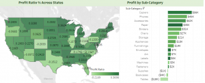 fig2.2: Profit Ratio % across States with the Sub-Category
The next level with two compelling plots. The first is an interactive map that unveils profit ratios for each state, allowing you to see at a glance how different regions are performing. And the one beside is the profit by sub category with copiers and phones making the highest profits. These categories may have a consistently high demand, leading to more significant sales and, consequently, higher profits. Bookcases and tables making negative profits.
A Click to Explore
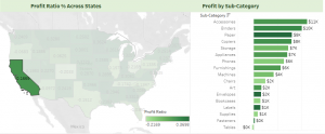 fig2.3: California Profits by Sub-Category
When you click on a state, the second plot comes to display profits by subcategory for the specific state you’ve chosen. It’s like having a magnifying glass on regional performance.
Dashboard3: Customer Analysis
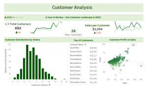
Customers lie at the core of any business. Understanding their identities, desires, and interactions with our products and services is absolutely crucial. The Customer Analysis Dashboard serves as your gateway to delve into this essential aspect of our operations.
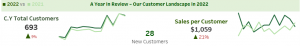 fig3.1: Customer Landscape in 2022
This part of the Customer Analysis Dashboard provides a snapshot of key customer metrics, giving you valuable insights into our customer base.
Let’s begin by looking at the total number of customers in 2022. It’s quite remarkable – we had 693 customers engaging with our products and services. However, we’re not stopping at the numbers alone. We’re also keen on understanding how our customer base evolved when compared to the previous year. In 2022, we saw an impressive 9% increase in our customer count. This signifies significant growth and hints at potential opportunities worth exploring.
Just as in our Sales Sparkline, the chart reflects the remarkable fluctuation in the number of customers throughout the year. November emerges as the peak, brimming with an abundance of customer activity, while February reveals its quieter side with the lowest customer count. It’s a reflection of the fascinating synchrony between customer trends and sales trends.
A significant aspect of our customer analysis is understanding new customer acquisition. In 2022, we welcomed 28 new customers, each taking their first step as making their first purchase in 2022.
Sales per customer is a critical metric. In 2022, customers contributed an average of $1,095 to total revenues, showcasing their value to this business. An increase in sales per customer from around $870 to $1,059 between 2021 and 2022 or around 20% YoY.
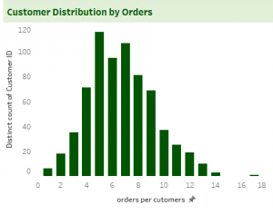 fig3.2: Customer Distribution by Orders Count
Our Customer Analysis Dashboard goes beyond the numbers to explore how the 693 customers are distributed based on the number of orders they’ve made. This histogram provides a visual narrative of our customer engagement.
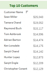 fig3.3: Top Customers by Sales
The Top 10 customers who have left an indelible mark on the sales performance. Every business has its champions, and these Top 10 customers stand as beacons of loyalty and value.
These Top 10 customers aren’t just recognized for their contributions in a single year; they’ve demonstrated their loyalty and impact over the years included in the dataset (2019-2022).
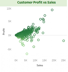 fig3.4: Customers’ Profits vs Sales
A dynamic dialogue between two vital business metrics: sales and profits. Each dot on the scatter plot represents a customer, and their position on this canvas tells a unique tale of how their purchases translate into financial returns.
One customer shines brightly: Sean Miller, the top sales contributor. His significant sales make him a vital player in the top Customers. However, a twist emerges when we examine his profitability. Despite his impressive sales, his profits are negative, signifying a cost-revenue imbalance. This negative profit ratio underscores operational inefficiencies in this customer relationship.
one customer grabs our attention: Tamara Chand. Her performance, especially in the realm of profitability, is truly exceptional. Tamara Chand secures her place as the 2nd top customer when it comes to sales. But here’s where the plot thickens. When we delve into the world of profit ratios, Tamara Chand takes the spotlight as the top performer. Her profit ratio stands at an impressive 0.47, revealing her remarkable ability to transform sales into profits efficiently.
Tamara’s case serves as a blueprint for maximizing profitability. It underscores the importance of not just high sales figures but also the efficiency with which those sales are converted into profits.
Thanks !

Your study offers a comprehensive dive into data analysis leveraging Tableau, providing a rich array of visual aids and in-depth analyses. It adeptly dissects key performance indicators like sales, profits, and quantity, rendering the data journey intriguing and accessible to readers. The clear and vivid descriptions, coupled with visual representations such as the sales Sparkline and the informative hex map displaying sales and profits across states, facilitate a better understanding of complex data. Moreover, the inclusion of the customer analysis dashboard deepens the reader’s comprehension of how customers impact sales and profits. Well done !
I’m always attracted to the sales market!! Good analysis with different type of charts!! Not surprising from you Racha, you’re always hard-working.