- Introduction
Millions of lives have been impacted by the COVID-19 pandemic, which has also stretched health systems to their breaking point. In this piece, we offer a data-driven visual narrative that examines the pandemic’s impact on various nations and areas, as well as its spread and survival rates. We created an interactive dashboard to showcase important trends and insights using Power BI and an extensive dataset that included the most recent COVID-19 case information. This page guides readers through the narrative that the dashboard’s images are presenting. - Dataset Description
The dataset used for this project, titled country_wise_latest.csv, was sourced from Kaggle. It contains up-to-date country-level data on:
– Confirmed cases
– Deaths
– Recoveries
– Active cases
– WHO Region
– Country/Region
The dataset offers a global snapshot of COVID-19 statistics and serves as a solid foundation for visual storytelling. - Visual Story & Dashboard Walkthrough
V1: Global COVID-19 Pandemic Impact (Map)
A world map visualizing the geographic spread of confirmed cases.
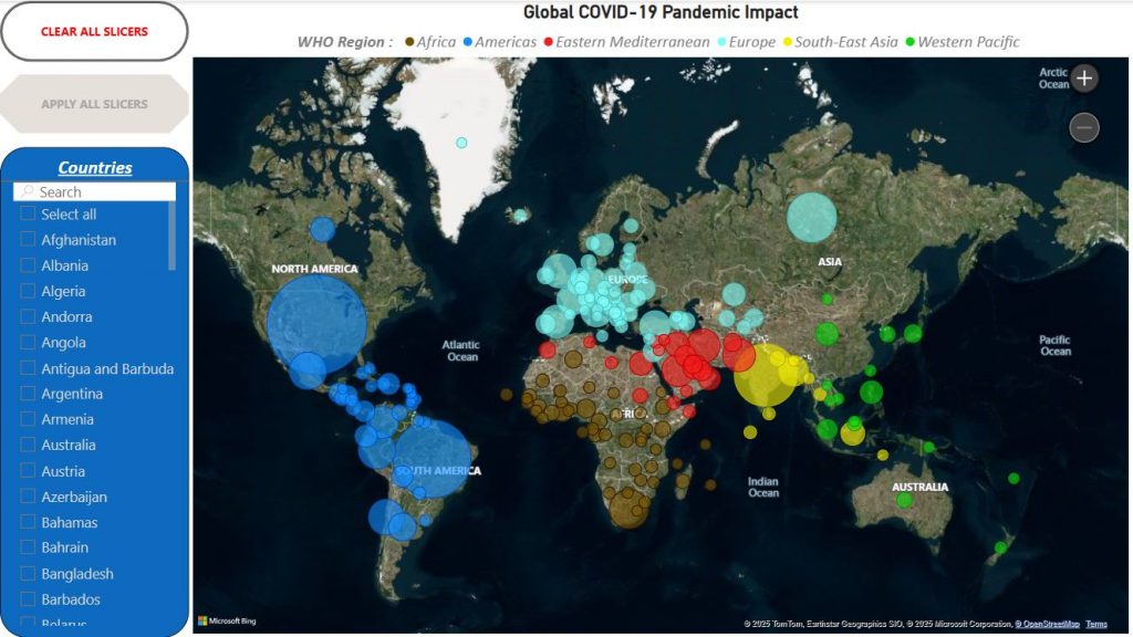
This map offers a powerful visual representation of where the virus has hit hardest, highlighting global hotspots at a glance.
V2: Top Countries by COVID-19 Deaths (Stacked Column Chart)
Comparing the countries with the highest death tolls.
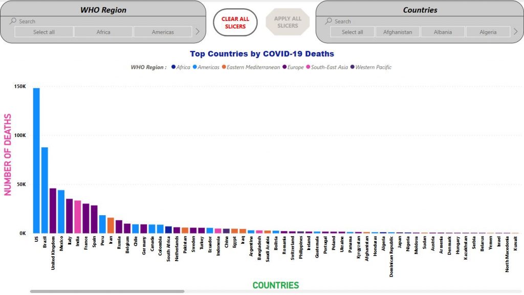
This chart shows that the pandemic’s most severe consequences were concentrated in specific countries, emphasizing the disparities in healthcare response and case severity.
V3: Survival vs. Mortality Rates (Stacked Bar Chart)
A comparison of recovery and death percentages.
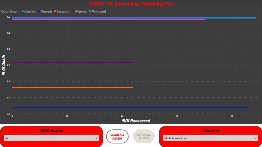
We calculated the recovery and death ratios to reveal how each country is managing the crisis. Most countries have high survival rates, but the difference in death percentages is telling.
V4: Active Cases Funnel
A funnel showing the number of currently active cases.
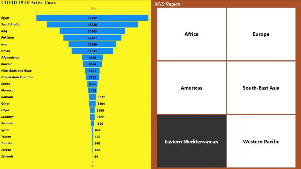
This visual gives a snapshot of the current situation by focusing on active cases globally, helping us understand how much of the crisis is still ongoing.
V5: Confirmed Cases by Country (Donut Chart)
Showing the share of confirmed cases by country.
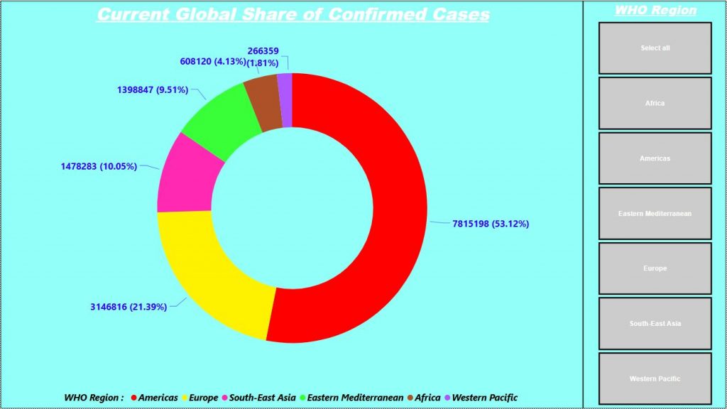
This visual highlight the countries contributing most to the global case count. It shows the imbalance in case distribution and helps identify regions with higher caseloads.
V6: Dashboard – Global COVID-19 Snapshot
All visuals combined into an interactive dashboard.
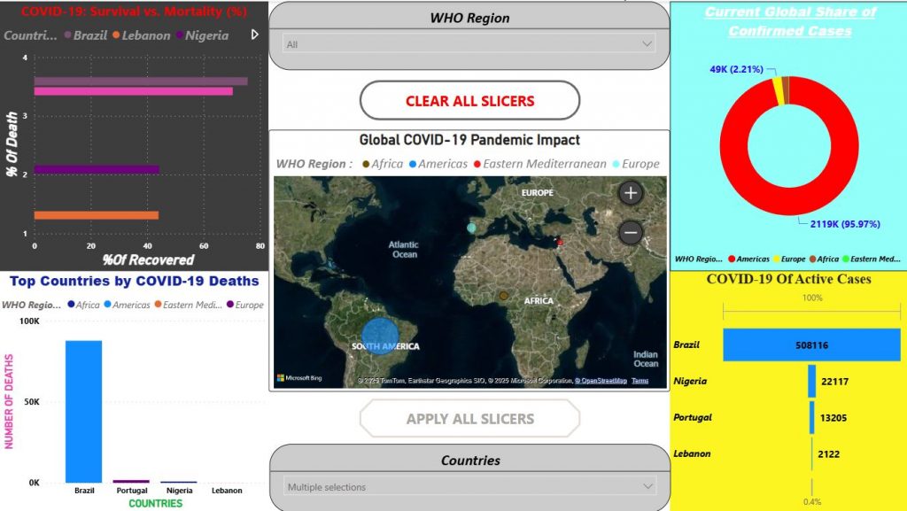
This dashboard allows users to explore the data by country or region, interact with filters, and uncover trends through visuals.
4. Key Insights
- The Americas and Europe had the highest confirmed cases globally.
- A few countries account for a disproportionately large share of total deaths.
- Recovery rates are generally high, but some countries face higher mortality.
- Active cases remain significant, showing the ongoing impact of the virus.
- The data emphasizes the need for continuous healthcare response and data transparency.
5. Conclusion
This data visualization project highlights the power of combining datasets with storytelling tools like Power BI. With just a few well-crafted visuals, we can capture the global impact of a pandemic and provide actionable insights in an accessible format.
As the pandemic evolves, continuing to monitor such data is essential for informing public health decisions, promoting transparency, and driving international collaboration.
Ghady Nehme
Matricule: 253024
