In a world sweetened by chocolate, understanding what drives sales is more than just a matter of taste — it’s a data-driven journey. This article explores a comprehensive analysis of chocolate sales performance across countries, products, and salespeople, turning raw numbers into strategic insight. Through storytelling and data visualization, we peel back the layers to reveal what’s working, what isn’t, and where the future opportunities lie.
1: A Seasonal Symphony of Sales
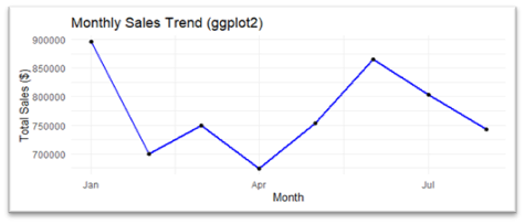
Our story begins with a time series analysis of monthly sales trends. The year kicked off with a bang — January recorded the highest sales, nearly $900,000. This peak likely reflects post-holiday purchases, successful marketing campaigns, or the tail end of seasonal promotions.
But not all months were created equal. Sales plunged sharply in February to around $700,000, hinting at a possible combination of shorter months, reduced demand, or logistical slowdowns. March and April showed signs of modest recovery, though April dipped again near $680,000 — perhaps a reflection of end-of-quarter fatigue.
Then came the sweet surprise: a resurgence in May and June, peaking again at $870,000. Whether due to summer cravings, campaigns, or restocking efforts, this rebound signals valuable seasonality patterns. July, however, showed the beginning of a downward slide once more — a reminder that trends can melt as fast as they rise.
| Graph 1: monthly sales trend |
2: Winners and Wallflowers on the Product Shelf
Diving into product-level performance, we used lollipop charts and treemaps to visualize the revenue generated by each chocolate offering.
Top Performers:
- Smooth Silky Salty
- 50% Dark Bites
- White Choc
- Peanut Butter Cubes
These aren’t just bestsellers — they’re revenue anchors. Their consistently large presence across visualizations marks them as the clear consumer favorites, possibly due to their unique flavor profiles, branding, or availability.
Middle Ground:
Products like 85% Dark Bars, Mint Chip Choco, and Milk Bars fall in the mid-tier — not top performers, but dependable contributors. With a little push in marketing or bundling, they could rise further.
Lagging Behind:
At the bottom of the shelf lie 70% Dark Bites, Caramel Stuffed Bars, and Choco Coated Almonds — small rectangles in the treemap, short sticks in the lollipop chart. Their muted performance might point to niche appeal, poor positioning, or simply a mismatch with market taste.
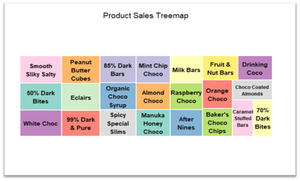
Graph 2: Product Sales Treemap
3: Mapping Global Appetite
A country-level analysis revealed Australia as the reigning chocolate capital, with sales soaring over $1 million. The UK, India, and the USA formed a competitive middle tier, while Canada and New Zealand trailed slightly behind — offering both opportunity and room for strategic investment.
Interestingly, scientific notation in the visualizations reminded us of the sheer scale — millions in chocolate sales across borders.
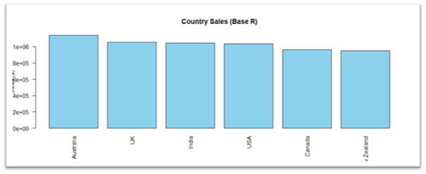
Graph 3: Country Sales
4: The People Behind the Product
Salespeople are the real-world catalysts of chocolate distribution. To measure their effectiveness, we looked beyond total revenue to sales per box shipped — a key indicator of efficiency.
Using bar charts and bubble plots, we uncovered four distinct profiles:
High-Efficiency, Low-Volume
- Wilone O’Kielt and Van Tuxwell shipped fewer boxes but sold premium products, generating over $45 per box.
Balanced Pros
- Roddy Speechley, Oby Sorrel, and Mallorie Waber found the sweet spot between volume and value, proving to be strong, consistent performers.
High Volume, Low Efficiency
- Andria Kimpton and Barr Faughny moved a lot of boxes — but at lower per-unit returns, possibly indicating bulk sales or aggressive discounting.
Low Efficiency, Low Volume
- Karlen McCaffrey and others in this quadrant may need support, training, or reassignment to improve results.
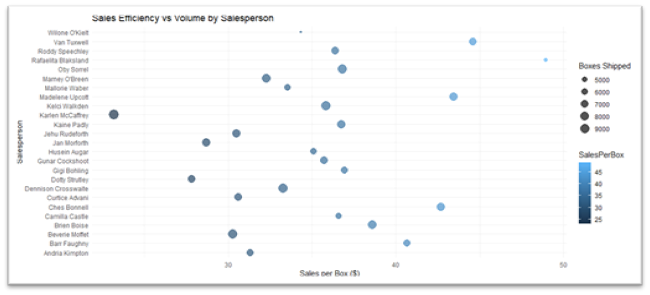
Graph 4: Sales Efficiency vs Volume by Salesperson
5: Is More Really More?
To answer whether shipping more boxes results in more money, we ran a correlation analysis between Boxes Shipped and Sales Amount. The result? −0.019 — a near-zero correlation.
This tells a clear story: volume does not predict revenue. A scatter plot confirmed this: data points were scattered, and the regression line was flat. Some small shipments brought big bucks, while large shipments sometimes yielded little. It all depends on what’s in the box, not how many.
6: Predicting the Future — Or Not Quite
We then built a regression model to predict Sales Amount based on Boxes Shipped, Product, and Country.
The model, however, struggled. The predicted values clustered tightly between $5,000 and $6,500, ignoring the wide real-world range of $0 to $20,000+. This is a classic case of underfitting — the model was too simple for the data’s complexity.
The actual vs predicted scatter plot showed large deviations, especially at the extremes. Our conclusion: linear models might not cut it. Decision trees or machine learning models could better capture the nonlinear patterns hidden in the chocolate chaos.
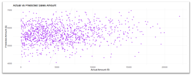
Graph 5: Actual vs Predicted Sales Amount
