Olist Website Layout
https://olist.com/
Hi! If you are reading this blog it’s either because you are interested in Business Intelligence Dashboards, or E-Commerce Shopping, but again who isn’t! In the following article, we will be covering essentials dashboards that highlight insights for the business intelligence team for an E-Commerce website in order to make more effective and faster business decisions using Power BI.
We will be following the below outline so feel free to jump into the parts that interest you the most:
- What is Olist?
- Business Intelligence Dashboards:
- Customer Analysis (Overview)
- Customer Analysis (More Details)
- Delivery Time and Orders Status
- Sellers Analytics
- Customer Rating and Twitter Data
- Bonus Dashboard
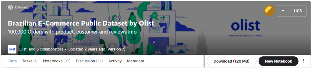
What is Olist?
https://www.kaggle.com/olistbr/brazilian-ecommerce
Olist is the largest department store in the Brazilian marketplaces, it connects small business from all over Brazil to channels without the hassle and with a single contract. Those merchants are able to sell their products through the Olist Store and ship them directly to the customers using Olist logistic partners.
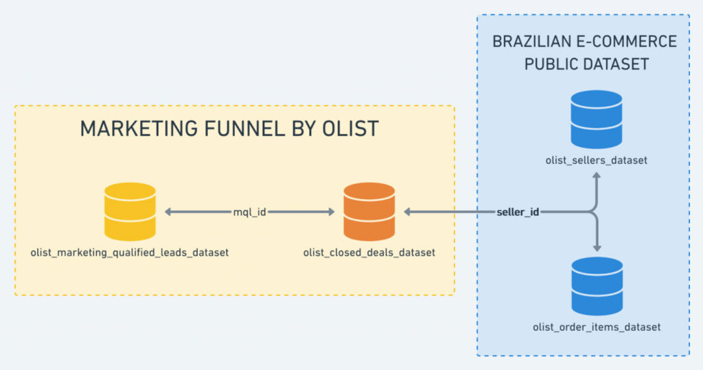
We will be using two (2) datasets to create our dashboards:
- Brazilian E-Commerce Public Dataset by Olist
- Marketing Funnel by Olist
https://www.kaggle.com/olistbr/brazilian-ecommerce
https://www.kaggle.com/olistbr/brazilian-ecommerce
https://www.kaggle.com/olistbr/marketing-funnel-olist
https://www.kaggle.com/olistbr/marketing-funnel-olist
Business Intelligence Dashboards
In this section, we will be covering the 5 essentials dashboards listed in the introduction, enjoy!
1. Customer Analysis (Overview)
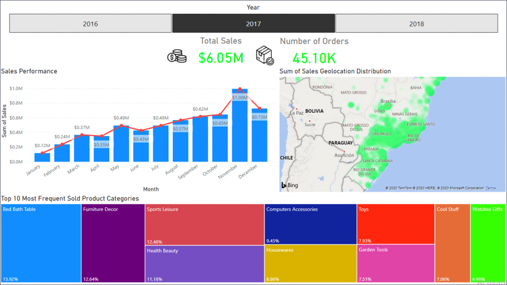
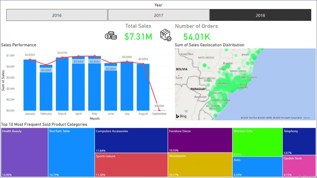
From this dashboard we can see- across different years – the total sales, number of orders, sales performance throughout months, sum of sales on a geolocation heatmap, and finally the top 10 most frequent sold product categories.
The business team using such a dashboard can easily see and assess any anomaly in the sales performance like a sudden drop and surge in order due to seasonality for example, in addition, they can decide to expand to expend into cities of interest using the geolocation map or focus on a specific product category in each different city due to the fact that a certain product category has the highest sales at this given city.
2. Customer Analysis (More Details)
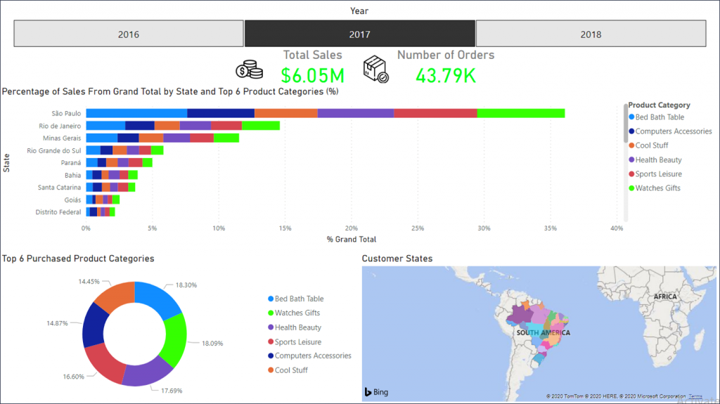
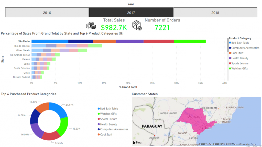
Using this dashboard can help us compare the percentages of sold categories between cities, in addition, we can « drill down » into a specific city, so if we simply pressed on Sao Paulo we can get its location on the map, and the donut chart updated to get the Top 6 Purchased Product Categories with their percentages.
3. Delivery Time and Orders Status
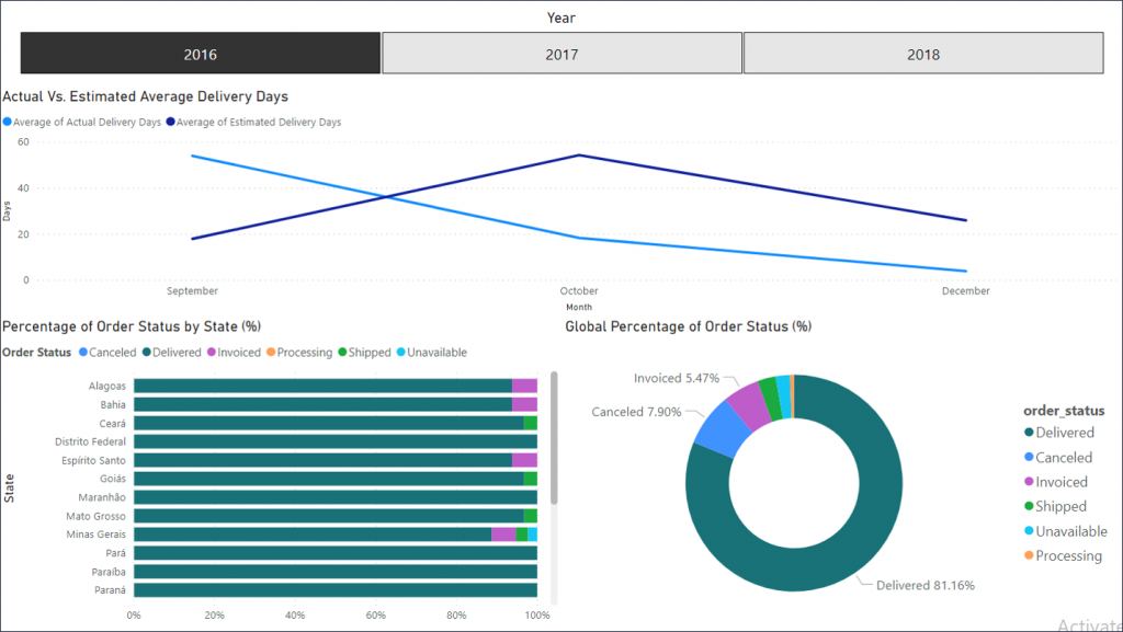
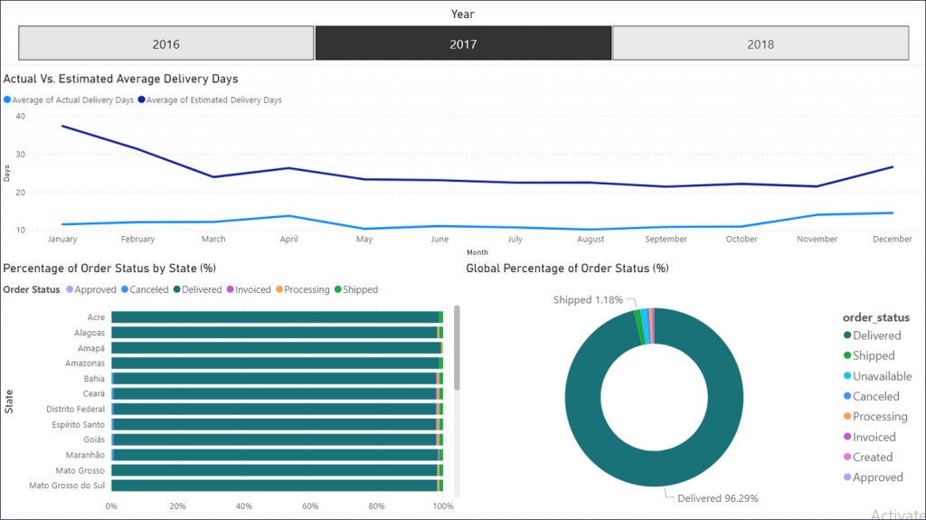
One of the most important KPI is the estimated delivery time that we promise our clients that we will deliver accordingly, due to the fact that giving a wrong estimated delivery time can result in canceled orderers, bad reviews, and unfortunately, customers leaving our service. Hence it is really important to keep a dashboard to monitor such metrics.
We can see that in the first operational year (2016) in September we were promising the wrong estimated delivery time, which translated as we see in a larger percentage of canceled deliveries, but on a positive note, we can see that in the following year (2017) we overcame this issue since we are providing an estimated time for our clients but we are delivering the orders much earlier on average! which again translated into way less canceled orders.
4. Sellers Analytics
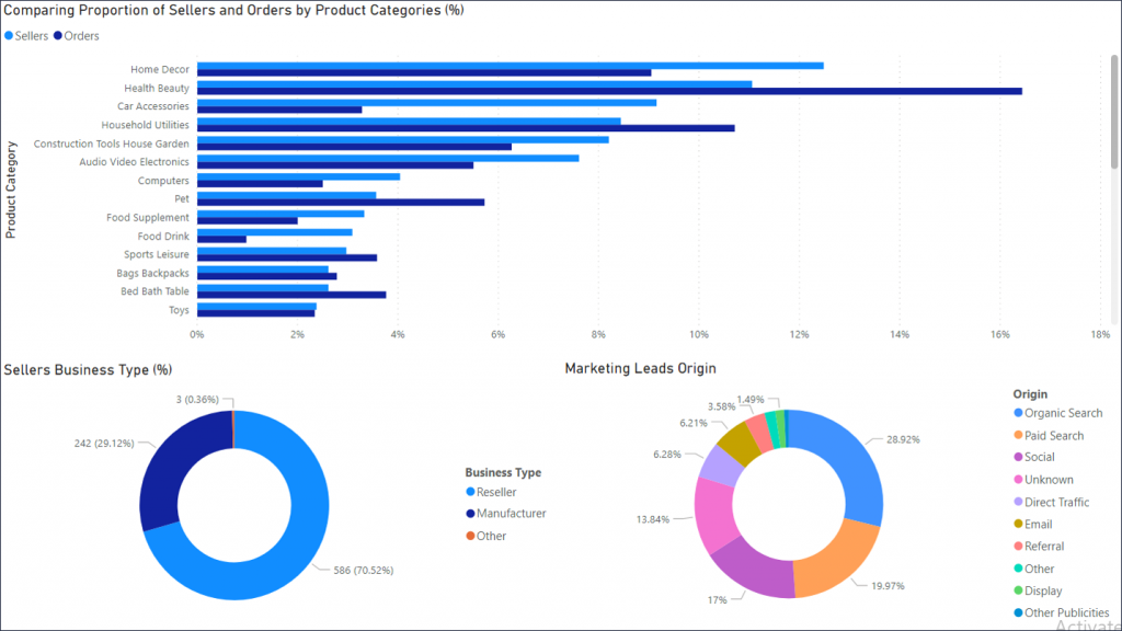
Since our business has two (2) client sides, the 1st is the buyer and the 2nd is the seller, is it important to create dashboards to keep an eye on our sellers, which at this point can be considered as partners, hence I created this dashboard, the horizontal bar chart aims to monitor the harmony between the percentages of Sellers and Orders by Product Category, and this is for the sole purpose of not having only 1 or very few sellers for a product category that has a relatively high percentage of orders made, once we notice that we have very few Sellers for a specific Product Category we can contact our Marketing team and ask them to onboard Sellers of this Product Category so we can maintain the harmony of Demand and Supply without helping in creating a Monopoly.
The other two (2) donut charts are for getting to know the Type of Sellers Percentages (i.e. Manufacturers, Resellers, etc..), in addition, to know the percentages of the Marketing Team Leads Origin, which is though which channels we are onboarding our Sellers, so we can spend our marketing advertisement in the right channel.
5. Customer Rating and Twitter Data
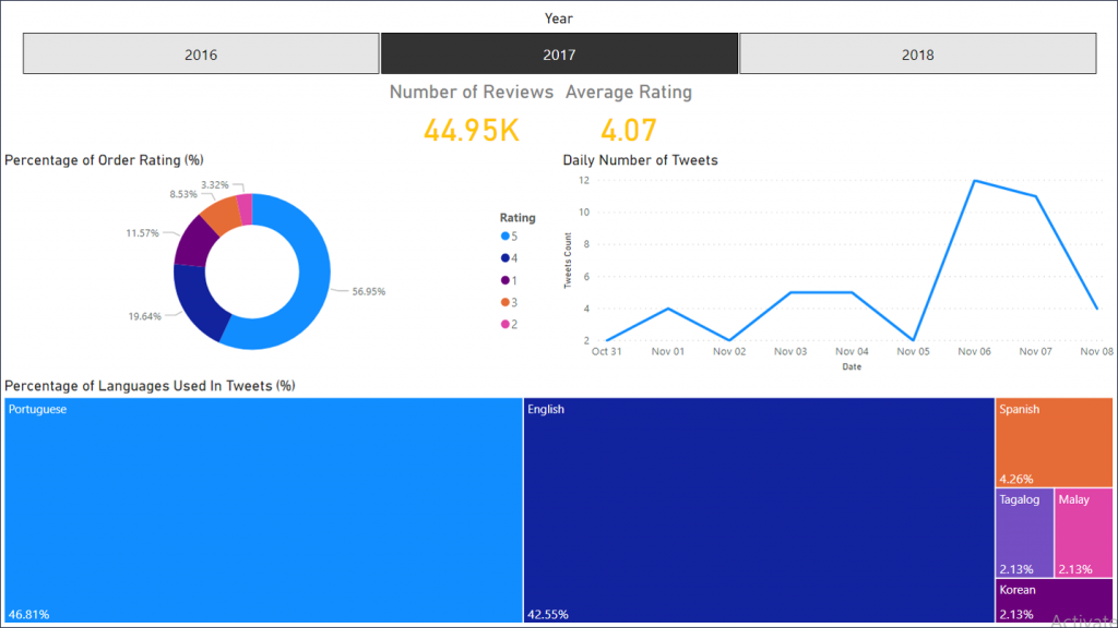
Paying close attention to our customer’s reviews and social media engagement is never a bad idea, after all this is one of the most essential ways to stay in contact with our user base.
This Dashboard highlights the percentage of order ratings, the number of tweets using #Olist, in addition to the language used in tweets which might help address our customer base in the language they prefer using on a such platform!Conclusion & Bonus Dashboard
Bonus Dashboard
We can clearly conclude how easy it can be extracting insights from raw data that we have in the real world which will be a huge advantage in decision making and hopefully in creating competitive business advantage.
A Picture is Worth 1,000 Words, Our Dashboards are Worth 100,000 Records, and Insights are priceless.
Since you reached the end of this blog, I would like to congratulate you for going through all of it and would like to offer you the bonus dashboard below!
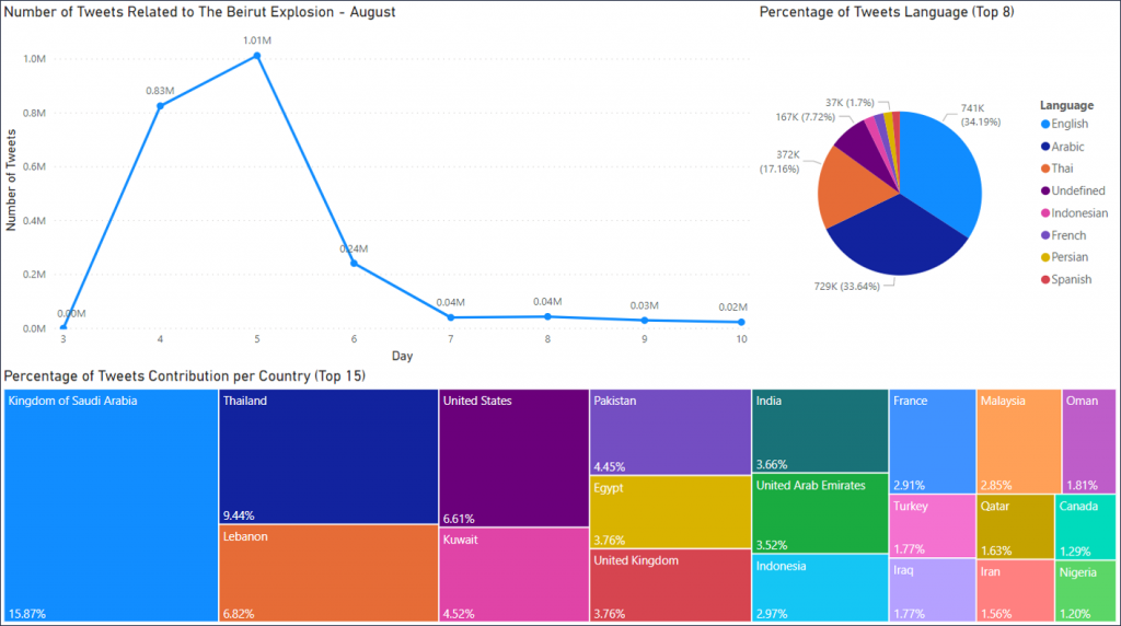
In this blog, we did not get to talk about how « powerful » Power BI can be, so above I am showing a dashboard that I have created from Twitter Data that I have collected after the 4th of August Beirut Port Catastrophic Explosion, which turned out to be the data of more than 2.2 Million Tweets from people all around the world offering condolences, Power BI can be extremely powerful and very easy to use, and I would advise you to go ahead and give it a try! Go to the following link for more information on Power BI!
Link: https://powerbi.microsoft.com/en-us/landing/signin/

Hello, I am new in learning power bi. Do you have the power bi desktop version saved somewhere so that i can see how the dashboards were created?
Hello,
Sorry it’s not available
I’m not positive where you’re getting your information, however great
topic. I needs to spend some time learning more or figuring out more.
Thanks for magnificent information I was searching for this info for my
mission.
Hey very cool website!! Guy .. Beautiful .. Superb .. I will bookmark your blog and take
the feeds also? I’m happy to find numerous helpful info here in the
publish, we need develop more techniques in this regard, thank you for sharing.
. . . . .