Most retailers go frustrated in understanding their stores, trying to collect the most possible Key indicators to figure out their performance, the possibilities that aren’t taken into consideration, the constraints and challenges in order to figure out better opportunities and future targets to create a better shopping experience to retain their customers and get better financials.
Today, the need of business intelligence tools has become a major and bigger need in the retails industry, because of the many challenges and competitions either with other shops or the e-commerce platforms that are taking a big part of the fashion industry.
In this article we will go through different Key Performance Indicators (KPI) that are mainly common use in the fashion industry, operating in a small market like Lebanon during a its local crisis and global pandemic.
This demonstration illustrates imported datasets from real data of 4 local retails stores in Lebanon.
(The name of the stores, brand and some of the transactions were reversed, changed or removed to conserve the data privacy and confidentiality of information of the mentioned stores and their related company.)
We will use Power BI, a powerful Business Intelligence (BI) tool developed and published by Microsoft. We will be using it to understand different aspects of these stores, and answer questions like: What is the best performing location? Which one has done a better job than last year?
- What is the best performing location? Which one has done a better job than last year?
- Which location has a bigger stock volume?
- The larger gross margin?
- Which items are more profitable?
- Do we sell more sale items?
- How much did the exchange rate affect our sales?
- Do we have more female or male customers?
Which store is performing better?
In this section, we will cover the some of the 7 pages resulted of the studied KPI and data.

The overview page gives a first impression on the main titles that interests the stakeholders.
Key indicators like the quantity sold, the gross margin (Profit Percentage), total net sales in US Dollars and average sales price in the local currency.
It includes a area chart that visualizes the net sales over the time, in addition to the Average Basket Value (ABV), an indicator that shows the amount spent by shoppers in one transaction on average, the Unit Per Ticket (UPT), measuring the average number of items that customers are purchasing in any given transaction and the Sales Per Square meter (SALES/SQM) in US Dollars, that divide the sales by the store’s total square meter of selling area.
On the top right of the page, the user can go through filters, to tackle specific needed areas, either on time series or locations.
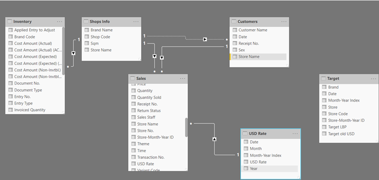
Like for Like (LFL) sales:
This section introduces a comparative table of figures between 2 period of time, also based on the user’s decision, in addition to a plot that visualize the stores net sales in USD along with the sales Per SQM and the quantity sold during a Year x variable.
This section helps the user to compare the stores performance during the 2 different periods.
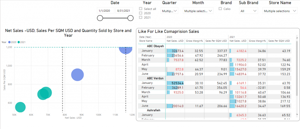
How are the products performing?
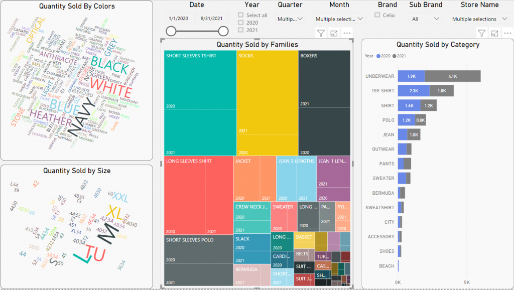
Figure 4 – Performance by Products 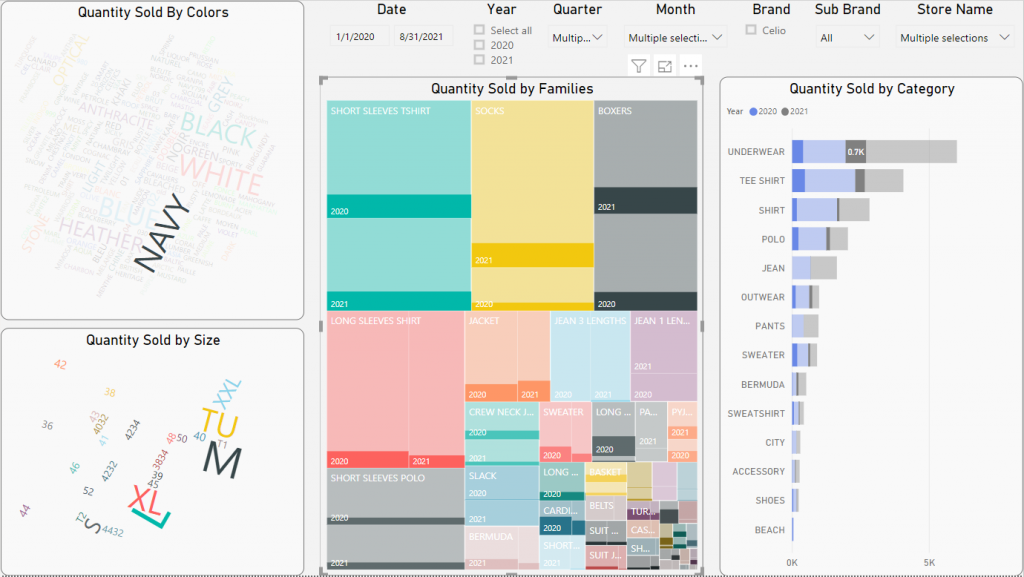
Figure 5 – Performance of Products in Navy Color 
Figure 6 – TREEMAP of subcategories performance of items in navy color
This section grants an understanding to the user for getting a better image of the sold products in the store.
Using a word cloud visualization, the user can refer the top selling colors and sizes having the larger fonts, a tree map showing the top performing families and bar chart showing the categories performance.
How is the exchange rate in US Dollars effecting the customer engagement?
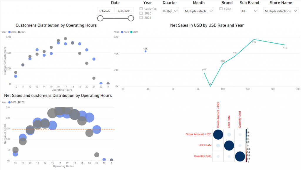
This section gives insights on the relationship between the devaluation of the local currency to US Dollars, the store sales and the customer engagement.
It also shows two plots showing customers turnover during the daily operating hours and the relation of the net sales and customer distribution during the same period.
In addition to a correlation plot showing the relation between the Gross Sales Amount, the quantity sold and the variance in US Dollar value. Whenever the circle is larger and blue, the relation appears to be greater.
Should we target more females or males?
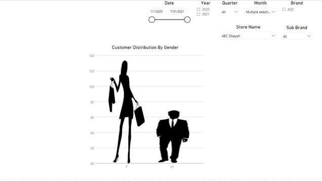
Taking into consideration the gender of the customer may be beneficial for a retail, to understand its market and buying force. It gives an idea about the products type that a retailer should invest in more. Who to target and much more questions related to customers.
The infographic pictogram in this section, shows that females are more frequent customers in the studied shops.
Conclusion:
A KPI dashboard displays key performance indicators in interactive charts and graphs, allowing for quick, organized review and analysis.
It helps stakeholders to understand their market, their industry performance and helps them to build on the studied data to build on and support their vision to make better decision making in future investments.
