Introduction:
Which country is advancing most quickly, and which one is witnessing the most deaths?
The world map shows various data that can be analyzed to predict the future of our world.
As the world is aging it is important to keep each year’s country data for the future.
What will be studied within a country?
- Location Code
- Year (1950-2021)
- Total population
- Male Population
- Female Population
- Median Age of the Population
- Population growth (yearly)
- Mean Age of Childbirth
- Total Deaths
- Male Deaths
- Female Deaths
- Life expectancy at birth (Both sexes)
- Life expectancy at birth (Female)
- Life Expectancy at birth (Male)
- Infant Deaths under the age of 1
- Net number of Migrants in the country [The number of immigrants minus the number of emigrants over a period]
- Area in Km2 of the Country
- Current Capital(s)
ONE COUNTRY ANALYSIS
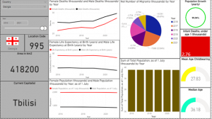
A random country has been chosen.
The data in Georgia will be studied from 2016 till 2021.
- The current flag of the country

- The location code (995)
- The current area of the country (418,200 km2)
- The current capital (Tbilisi)
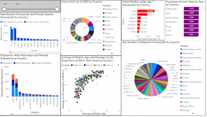
Female and Male deaths:
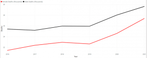
2021 had the highest female deaths at 27.39 (thousands) and it is 27.72% higher than 2016 which had the lowest Female deaths at 21.44 (thousands)
Life Expectancy at birth:

We notice that the Female year expectancy is always higher than the male’s life expectancy.
In 2021, here are the values
Female and Male Population:

The male population decreased from 1776.80 (thousands) to 1766.89 from 2016 till 2021 whereas the female population increased from 1994.31 to 1996.13 from 2016 to 2018 then it decreased and reached 1991.09 in 2021
Total Population:

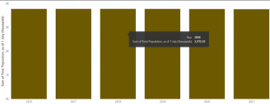
From the column chart we notice that at 3,772.33(thousands) , 2018 had the highest sum of total population and is 0.38% higher than 2021 which had the lowest sum of total population.
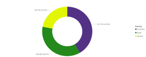
Net number of Migrants:
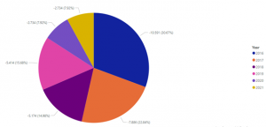
This pie chart shows the net number of migrants (Thousands) by year.
Today, more people than ever live in a country other than the one in which they were born.
In Georgia throughout the 2016 to 2021 years the number of migrants is negative.
The pie chart below shows the net number of migrants (thousands).
We can see that 2021 had the highest number of migrants, which in our case here means that
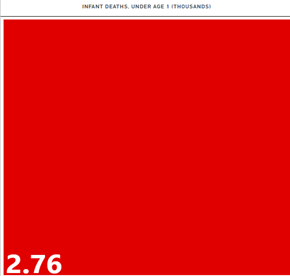
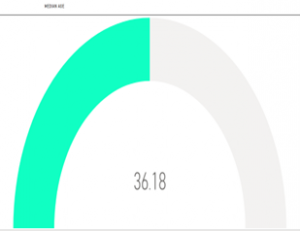
Population growth, infant deaths under the age of 1, mean childbearing and Median age:


From 2016 to 2021 the population growth changed 99.94%
2.76 (thousand) of infant deaths under age of 1 happened.
The mean age of Childbearing is ~27.83
While the median age is ~36.18
COMPARING 3 COUNTRIES
Now let’s compare 3 random different countries :
- Colombia
- Egypt
- Ukraine
We will be looking at the data in the year of 2015.
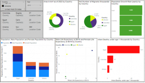
We can see in a multi-row card the capital(s) of each country and the location code.
- Colombia having Bogota as capital and 57 as location code
- Egypt having Cairo as capital and 20 as location code
- Ukraine having Kyiv as capital and 380 as location code
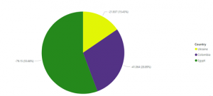
Population, Male Population and Female Population:
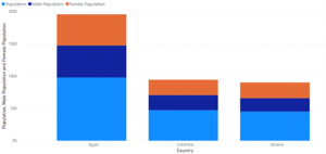
In a column chart we can compare each country population, male population and female population and we can also compare it to the other countries.
We can see that Egypt has the highest population, in addition the highest male and female population.
Though comparing each country’s female and male population we get that in 2015:
- 7% of Ukraine population is Female
- 6% of Colombia population is Female
- 3% of Egypt population is Female
Area in km2:
Colombia has the largest land area then comes Egypt 2nd and Ukraine last.
Net number of Migrants:
Male and Female Life Expectancy at Birth:

The Scatter plot between male and female life expectancy shows that:
In 2015, Egypt had both lowest male and female life expectancy at birth (Female = 73, Male = 68)
While Colombia had the greatest male and female life expectancy (Female=79, Male = 73)
Population Growth Rate:

The population has increased by:
- 2% from 2014 to 2015 in Egypt
- 9% from 2014 to 2015 in Colombia
- 6% from 2014 to 2015 in Ukraine
Infant deaths under the age of 1 (thousands):
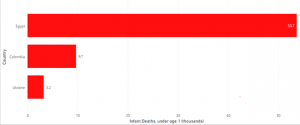
Egypt has witnessed the most infant deaths between these 3 countries in 2015, with a total of 53.7k deaths.
Conclusion (globally):
We will be analyzing all the countries from 1950-2021 and compare them.
Just by taking the top (or first country of each visual)
- Russia has the largest area Km2 then comes Canada 2nd
- There have been more male deaths in China than any other country during 1950-2021, while India had the most Female Deaths.
- China, India, and USA are the top 3 countries with the most population accordingly
- The average median age in Monaco is 45.37 while in Niger it is 14.8
- South Sudan has the lowest life expectancy for both sexes at 16.72 while Iceland 77.31
- The most Infant deaths happened in India with a total of 167 million deaths from 2015 – 2021
- From 1950 till 2021, UAE (United Arab Emirates) had the best population growth among all countries.
- USA had the greatest number of migrants.
