Managing personal finances is something almost everyone experiences, yet spending behavior often hides patterns that are difficult to notice in daily life. Some expenses appear predictable, while others fluctuate depending on season, payment method, lifestyle, or category.
This project was built around one central question:
Can data visualization reveal hidden patterns in personal spending behavior?
To explore this idea, a personal spending dataset covering transactions between 2023 and 2025 was analyzed using Power BI. The dataset contains information about transaction dates, spending categories, payment methods, months, and expense amounts.
The objective was not only to calculate totals, but also to transform raw financial data into an interactive visual story capable of uncovering trends, habits, and relationships inside everyday spending behavior.
The project combines data cleaning, financial analysis, forecasting, and dashboard design to create a complete analytical experience.
1. From Raw Financial Records to Interactive Analysis
Before creating the dashboard, the dataset needed preparation and transformation.
The original dataset contained fields such as:
- Date
- Category
- Amount
- Payment Method
- Month
Several transformations were performed inside Power BI using Power Query and DAX calculations. Numerical metrics and calculated measures were created to make the analysis more meaningful and interactive.
Some of the important calculated indicators included:
- Total Spending
- Average Spending
- Maximum Expense
- Transaction Count
- Spending Level
- Cash Spending Ratio
- Digital Spending Ratio
- Monthly Spending Trends
- Risk Levels
Additional categorical fields were also generated, such as:
- Seasons (Summer/Winter)
- Payment Types (Cash, Card, Online)
- Spending Categories
- Monthly Classification
This preparation stage was essential because raw transaction records alone do not easily reveal financial behavior. Clean and structured data allows patterns to become visible through visualization.
2. Understanding Spending Trends Over Time
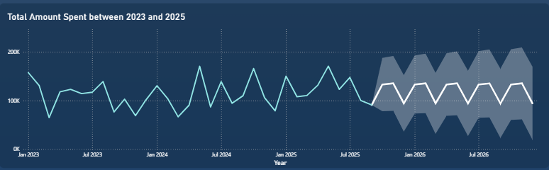
Figure 1: Spending trends and forecasting analysis
The first dashboard focuses on the evolution of spending behavior over time.
A line chart was used to display total spending between 2023 and 2025. The visualization highlights how expenses fluctuate across different months and periods.
At first glance, spending appears relatively stable. However, several peaks and drops emerge throughout the timeline. Some months experience significantly higher expenses, suggesting seasonal effects, lifestyle changes, or special financial events.
The dashboard also integrates forecasting functionality. The projected area on the graph estimates future spending behavior based on historical trends. This transforms the dashboard from a descriptive tool into a predictive one.
The key insight is that personal spending is not perfectly consistent. Even within similar income conditions, expenses naturally fluctuate over time. Forecasting helps anticipate future financial pressure and encourages more informed budgeting decisions.
3. Payment Methods and Financial Behavior
Figure 2: Spending distribution by payment method
One of the most interesting aspects of the project was analyzing how payment methods influence spending patterns.
A bar chart compares spending distribution across categories such as:
- Health
- Food
- Transport
- Rent
- Shopping
- Entertainment
- Utilities
The visualization is filtered dynamically by payment type and season.
The results suggest that spending behavior changes depending on how transactions are made. Categories like shopping and entertainment often show stronger digital or card usage, while other categories may rely more heavily on cash transactions.
This reflects an important behavioral insight:
The method of payment can influence spending habits.
Digital payments often reduce the “physical feeling” of spending money, which may encourage higher or more frequent purchases. Cash spending, on the other hand, can create stronger spending awareness.
The dashboard demonstrates how financial behavior is connected not only to what people buy, but also to how they pay.
4. Seasonal Patterns in Personal Expenses
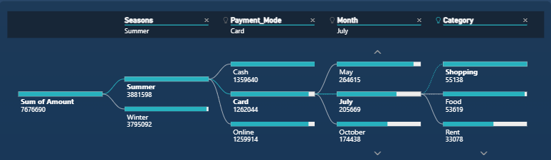
Figure 3: Decomposition analysis of spending behavior
The next dashboard introduces a deeper analytical structure through decomposition and hierarchical filtering.
A decomposition tree visualization explores how total spending changes across:
- Seasons
- Payment Methods
- Months
- Categories
This allows the viewer to drill progressively into the data and identify where spending concentrations occur.
For example:
- Summer and winter seasons show different spending intensities
- Certain months generate stronger transaction volumes
- Some categories dominate during specific periods
- Payment methods vary depending on season and category
This visualization transforms raw financial data into a decision-making path. Instead of simply observing totals, users can navigate through the factors driving expenses.
The analysis reveals that spending behavior is strongly contextual. Financial habits are influenced by time, environment, and purchasing situations rather than being completely random.
5. Which Months Generate the Highest Expenses?
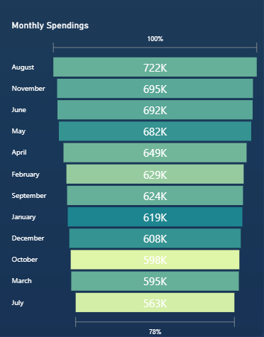
Figure 4: Monthly expense ranking
A funnel-style monthly spending chart was used to rank months according to total expenses.
The visualization immediately highlights the months with the highest financial activity. Some months clearly dominate the spending landscape, while others remain significantly lower.
This type of analysis is valuable because it helps identify recurring financial pressure periods.
For example:
- Vacation periods may increase entertainment and shopping expenses
- Seasonal bills may affect utilities or transport
- Lifestyle patterns may create recurring monthly peaks
Instead of treating every month equally, the dashboard demonstrates that personal finance has cyclical behavior. Understanding these cycles can improve budgeting and financial planning.
6. Risk Levels and Spending Categories
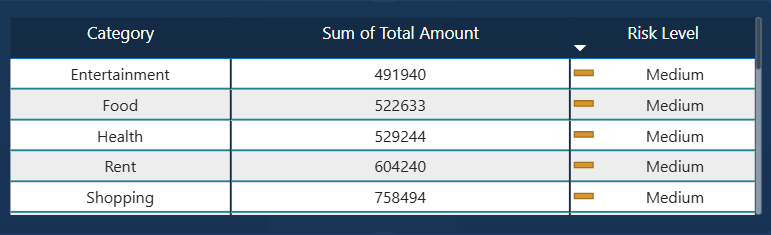
Figure 5: Risk analysis by spending category
The project also introduces a financial risk perspective.
A categorized spending table combines:
- Spending categories
- Total expense amounts
- Risk level indicators
The purpose of this visualization is to identify which categories contribute most heavily to financial pressure.
Some categories consistently generate larger expenses than others. Shopping, rent, and food often appear among the dominant contributors.
The “risk level” classification helps translate raw numbers into actionable interpretation. Instead of simply seeing totals, users can understand whether a spending category may represent a potential budgeting concern.
This creates a more practical and decision-oriented financial dashboard.
7. What the Dashboard Reveals
Across both dashboard pages, several important insights emerge:
- Spending behavior changes over time
- Financial habits are influenced by seasons and months
- Payment methods affect transaction behavior
- Certain categories dominate personal expenses
- Spending is cyclical rather than constant
- Forecasting can help anticipate future financial patterns
Most importantly, the project shows that personal finance is not only about totals and balances. Hidden behavioral patterns exist inside everyday transactions, and data visualization helps uncover them.
The dashboard transforms financial records into a visual narrative that is easier to understand, explore, and interpret.
Conclusion: Data Visualization Makes Financial Behavior Visible
So, can data reveal hidden spending behavior?
The answer is yes.
Data visualization makes it possible to detect trends, relationships, and financial habits that would otherwise remain invisible inside spreadsheets or transaction histories.
Through interactive dashboards, forecasting, decomposition analysis, and categorical comparisons, this project demonstrates how Power BI can transform simple spending records into meaningful financial insights.
The most important lesson is that spending behavior is influenced by multiple interconnected factors:
- Time
- Seasons
- Payment methods
- Expense categories
- Consumer habits
Financial analysis is therefore not only mathematical. It is behavioral, contextual, and predictive.
This project shows how business intelligence tools can help individuals better understand their financial decisions and build smarter budgeting strategies through data-driven insights.
Data Source and Tools
Dataset: Personal Spending Dataset (2023–2025)
Data Cleaning & Transformation: Power Query + DAX
Visualization Tool: Power BI
Techniques Used:
- Line charts
- Forecasting analysis
- Decomposition tree
- Funnel chart
- Interactive filters
- KPI cards
- Category tables
- Comparative bar charts
