Global Super Store Dashboard Analysis
In today’s changing business environment making decisions based on data has become extremely important. Where, effective analysis and utilization of the wealth of available information are vital in modern business management. To illustrate this, we have chosen the context of Superstores, which serve diverse customers with a wide array of products, and thus generate a large volume of data on a daily basis. To navigate through this amount of information we used power bi to build dashboards that contains valuable insights on different features of our data.
This dashboard is divided into three sections each providing insights into aspects of the business: Sales Analysis, Product Analysis and Shipping. The data within these sections contains pieces of information that empower the management team to improve efficiency enhance customer satisfaction and ultimately increase profitability where hear we can uncover the importance of data visualization reporting and analytics, in modern day business operations.
My objective from these dashboards is to make a clear and comprehensive report for sales managers so they may analyze and take a based data decisions on company sales strategies. As we all recognize the importance of continuously monitoring sales data especially in a retail company that used to sell online and ship worldwide.
I. Sales Analysis
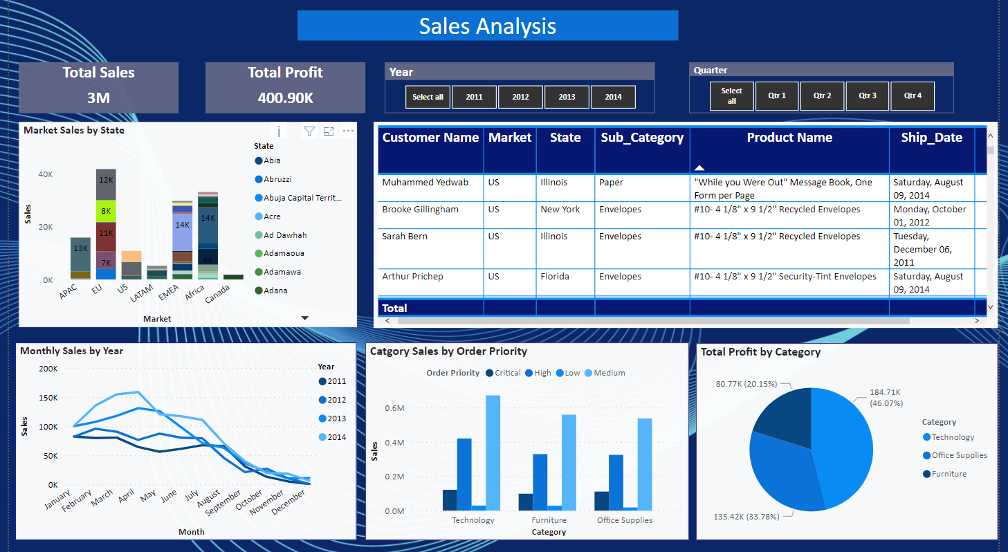
1. Market Sales By State :
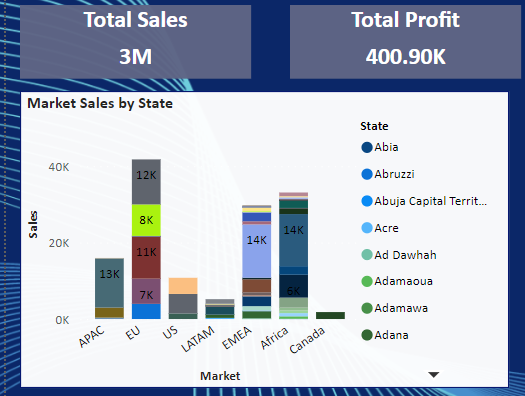
First, this graph is crucial to show the distribution of sales in each marketplace in addition you may found that every market is distributed into several states and shows each one of them the amount of sales by clicking on the state to the right as this graph and other graphs we will see are all interactive which makes it easier on the viewer to pick specific insights.
Furthermore, as shown in the 2 blocks above, the total profit is currently at $400.9k, where the dashboard offers the flexibility to adjust this data based on the year or quarters you choose from the dropdown menu. This feature is crucial for sales analysis, enabling us to track profit changes and trends over time in different markets and states.
2. Monthly Sales by Year and Category Sales By Priority
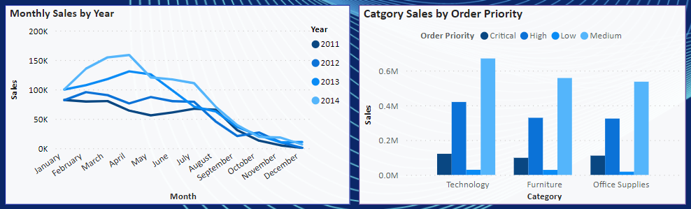
As we dive deeper we can sight the monthly sales graph that shows us the trends during the year where we can see that at the beginning of each year there is a high trend for sales and it start to decrease as the year goes on. This analysis is crucial to detect the problem and take some decisions and understand the sales behavior during the year.
The 2nd graph shows the order priority distribution of each category where we can detect that the most common priority between categories is medium and then high ones. Also we detect the sales amount of each priority for each category .
As a summary for the dashboard this dashboard allows sales department can analyze sales and profit through this dashboard and filter through years and quarterly sales.
- The company has made a Total Sales of 3 million and Total Profit of 400.9K between 2011- 2014.
- 1 million worth of sales and 119.11K profit was made in 2014.
- 46% of profit came from product category technology.
- Year 2014 March and April has seen high sales revenue and December being the holiday Season has the lowest revenue sales.
II. Product Analysis

1. Categorical Tree on Each Region
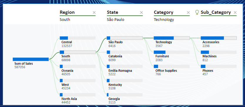
This tree shows exactly the number of sales of each sub category in each state and region this may be crucial for sale managers so they know which products are wanted more in each state, on other worlds this tree gives a general insight on sales distribution between regions and categories.
2. Categorical, Quantity, and Sales Graph
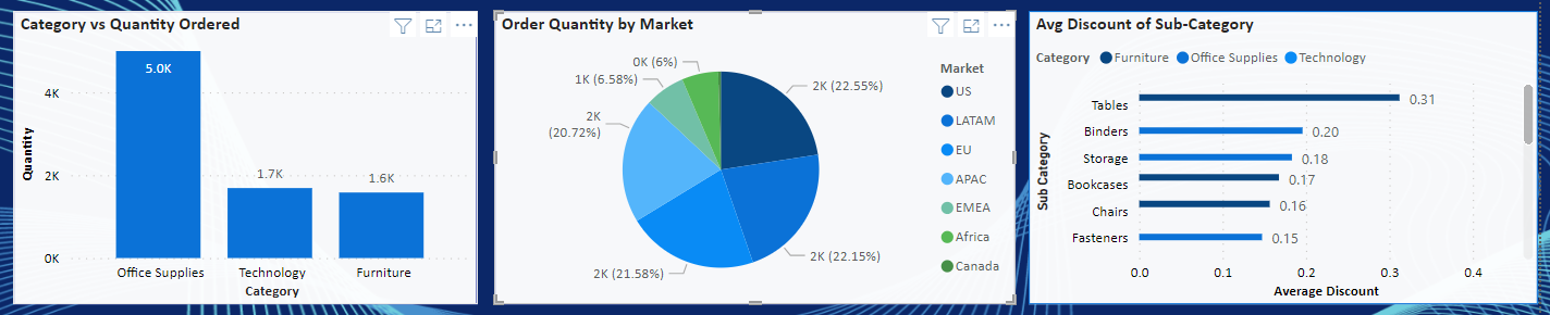
First graph shows the quantity ordered of each category which means we can interpret easily that office supplies are the most common products wanted by the customers .
In the second section, we utilize a pie chart to visualize the distribution of order quantity across various markets. This graph is pivotal as it reveals the most significant markets for our company’s products. Sales managers can draw connections between this graph and the categories of products being sold in these markets, helping them make decisions such as increasing advertising efforts in smaller markets.
In the third graph, I wanted to show the average discounts the company is giving on each subcategory also so they may take decision to increase sales on the subcategories with small avg sale.
As a conclusion, this dashboard dive deep into product categories, quantity ordered, product- subcategory.
- Highest amount of office supplies have been ordered in terms of quantity.
- Tables have been sold at an average discount of 28% in 2014
III. Shipping Analysis
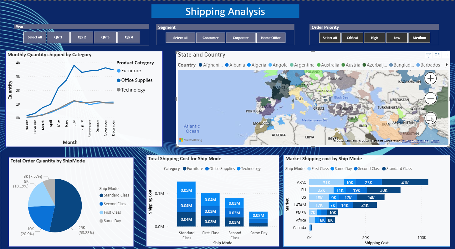
1. Monthly Quantity shipped by Category
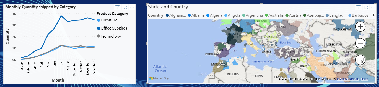
This graph shows the shipping quantity of each category and its clearly obvious that furniture category is the most wanted one as the quantity of shipping is so high compared to other categories , also we can detect the increasing of shipping quantities at the end o the year. On the other hand the map is only to show from which countries and states around he world are buying our products this is important for shipping managers.
2. Ship mode , Shipping Costs , and Markets
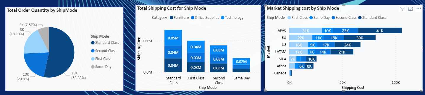
The first pie chart shows the distribution of shipping modes as we can take a general idea of our custom behavior for what do they prefer the mode of the shipping knowing that each mode had its cost as you can view that on the 2nd graph where each mode is has its own cost and you can see how they are divided into the categories each with her own cost . Furthermore, the last graph also shows the shipping costs distributed on the several markets where this graph is important since it makes sales managers apply solutions to reduce these shipping cost especially on markets with high shipping costs as opening a more branches there or something like this . As, shipping costs can have a significant impact on an online merchant’s profits.
Finally, as a conclusion :
- 53% of the orders have Standard shipping mode and lowest preferred is same day shipping.
- 41% of Orders with critical order priority have been ordered by first class ship mode.
- 100 % of the orders with low priority have been ordered through standard class.
- APAC markets have highest shipping cost, followed by EU and US.

Nice color theme but layout could be somewhat better
Impressive and professionally crafted visuals, meticulously structured, with seamless connections between thoughts. However, it’s important to note that references haven’t been mentioned, and the text could benefit from a smaller font size.
This blog detailing the ‘Global Super Store Dashboard Analysis’ is exceptional. I love it! It provides an in-depth breakdown of vital information through Power BI dashboards, offering insights into sales, product analysis, and shipping data. The thorough analysis and interactive graphs help in making data-driven decisions for sales strategies, especially in the retail sector. A comprehensive and informative piece!