Introduction
Picture this: You’re standing at the edge of the Grand Canyon, gazing at the vast expanse, feeling the wind on your face, and realizing just how small we are in the grand scheme of the universe. It’s moments like these that make travel an essential part of the human experience. But have you ever wondered what lies behind the scenes of the travel industry, beyond the glossy brochures and Instagram snapshots? Tourism isn’t just about snapping selfies at famous landmarks; it’s an intricate web of stories waiting to be unraveled. For you, it’s a destination. However, beneath every place unfolds a tale of visitor trends, economic impact, accommodations that hold countless memories, and sustainability efforts to protect the fragile ecosystem. In the spirit of Marcel Proust, the famous writer who once said, « The real voyage of discovery consists not in seeking new landscapes, but in having new eyes, » let’s embark on a journey to see the tourism industry with fresh eyes through the lens of data, revealing its hidden treasures.
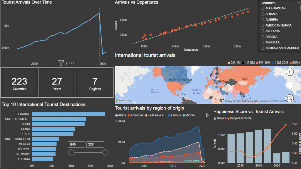
The Travel & Tourism market has weathered considerable challenges, from wars to natural disasters and, most significantly, the COVID-19 pandemic. In this blog, we will be presenting a dynamic dashboard that unveils unique insights across 223 countries and 7 regions, spanning 27 years, covering topics from tourist arrivals to employment trends. The analysis was conducted using Power BI, and the data for our exploration has been acquired from trusted sources, including the United Nations World Tourism Organization (UNWTO), the World Bank, the Organization for Economic Co-operation and Development (OECD), and Kaggle.
So, whether you’re a seasoned traveler, a curious explorer, a business visionary, or a policymaker, pack your bags and fasten your seatbelts because we’re about to take a thrilling data-driven journey into the world of tourism.

Dashboard Overview
Global Tourism Trends
1. Tourist Arrivals Over Time:
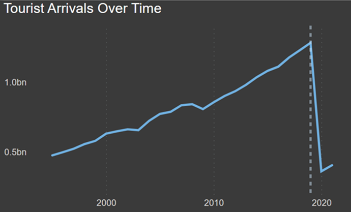
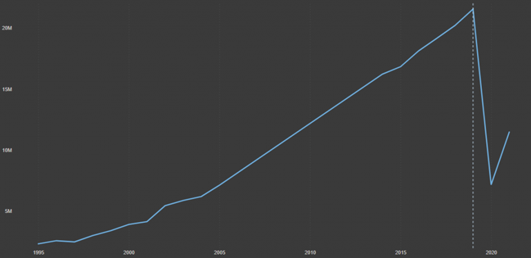
The line chart (Figure 1) illustrates the trends in total arrivals in the tourism sector for all countries between 1995 and 2021. The graph shows a consistent upward trajectory until 2019. However, in 2020, the COVID-19 pandemic triggered a sharp 70% decline, causing a significant disruption. Despite this setback, arrivals have embarked on a path of recovery, demonstrating a resilient rebound.
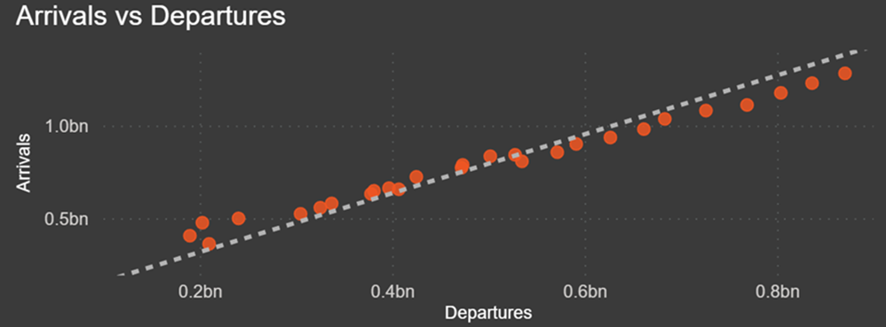
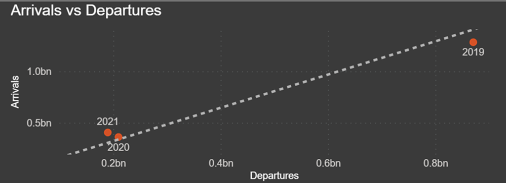
2. Arrivals vs. Departures:
The scatter plot below (Figure 2) provides a dynamic view of inbound and outbound tourism within a country. It highlights a consistent and proportional relationship between departures and arrivals, emphasizing their interdependence. Notably, the impact of COVID-19 is evident; the pandemic’s restrictions, lockdowns, and travel limitations profoundly affected the ebb and flow of tourists. While 2019 recorded the highest numbers of departures and arrivals, 2020 and 2021 marked the lowest points for both (Figure 3).
3. Global Scope of the Analysis:
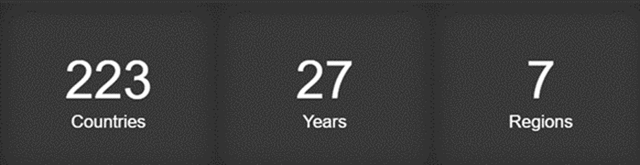
The three metrics (Figure 4) collectively convey the scope of the study, encompassing the number of countries, regions, and years examined, delivering valuable insights into the extent of the study’s geographical and temporal coverage.
4. International Tourist Arrivals by Country:
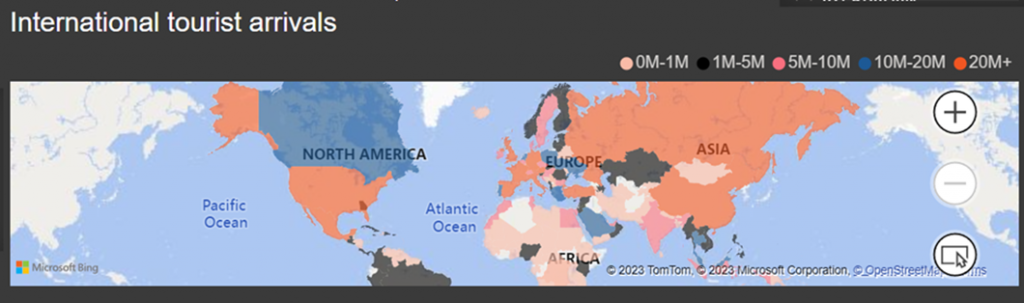
This map (Figure 5) provides a visual representation of international tourist arrivals, offering a geographic perspective on the destinations that have attracted visitors. The color-coding on the map reflects the varying levels of tourist arrivals. Notably, the US, Russia, and European countries, including France, Italy, Spain, and several others, have firmly established themselves as particularly popular destinations, drawing a substantial number of visitors. In contrast, a significant portion of the African continent seems to be emerging as relatively less frequented by tourists.
5. Top 10 International Tourist Destinations:
This bar chart (Figure 6) classifies the top 10 tourist destinations based on their average tourist arrivals over the years. The data reveals that France has consistently held its position as the leading destination for tourists throughout the 27-year period. Its appeal is underscored by a high and relatively stable average number of tourist arrivals. The US and Spain have also consistently ranked among the top three, demonstrating their enduring popularity.
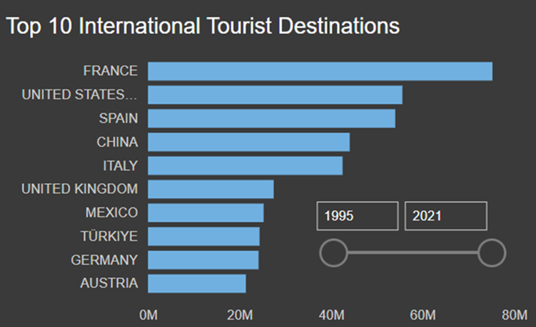
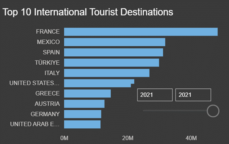
However, the most recent placement (2021) shows that UAE has emerged as a top destination for tourists (Figure 7). The rise of the UAE can be attributed to various factors such as aggressive marketing, investment in tourism infrastructure, and a focus on luxury and leisure offerings.
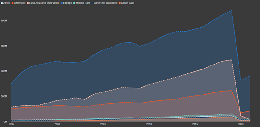
6. Tourist Arrivals by Region of Origin:
The area plot (Figure 8) illustrates tourist arrivals by region of origin. The most striking observation is the dominance of Europe as the primary source of tourists. This is consistent with historical trends, where European nations have been significant contributors to global tourism. This information can be of great value to tourism industry stakeholders. In fact, they can utilize it to tailor their marketing efforts more effectively.
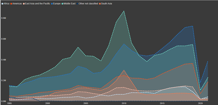
Zooming in on Lebanon (Figure 9), we can see interesting patterns in tourist arrivals. In 2010, the country reached its peak in terms of arrivals, with the Middle East region being the primary source of visitors. This could be attributed to various factors such as cultural ties, regional stability, etc.
However, when we look at the second peak in 2019, a notable shift in the origin of tourists is evident. In this year, the area plot reveals a significant increase in arrivals from Europe. This shift suggests a change in the tourism landscape for Lebanon. While the Middle East remained an essential source of tourists, Europe gained prominence as a key contributor, indicating a potential diversification of the country’s tourism sources.
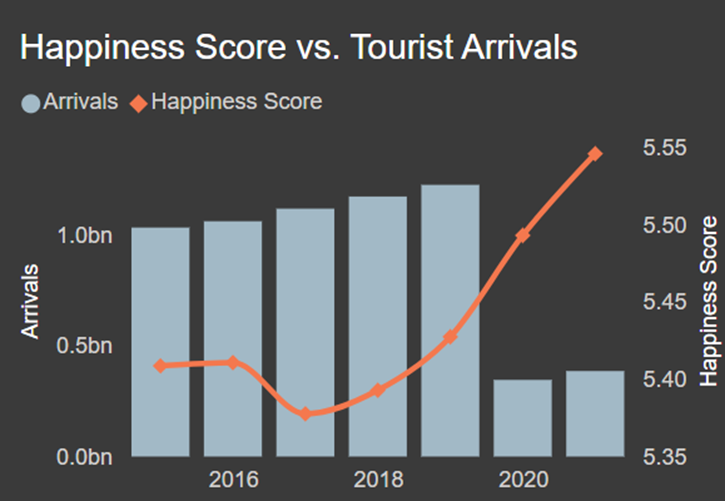
7. Happiness Score vs. Tourist Arrivals:
The plot « Happiness Score vs. Tourist Arrivals » (Figure 10) examines the relationship between the happiness score of countries and the number of tourist arrivals to those countries. This analysis may suggest an intriguing correlation between happiness and arrivals. As the happiness score increases, the number of tourist arrivals increases. In fact, countries with higher happiness scores are typically associated with a better quality of life, economic stability, and social well-being. In such nations, individuals may be more inclined to visit these countries, potentially resulting in an increase in tourist arrivals.
Travel Preferences and Sustainability
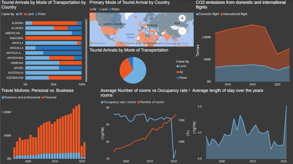
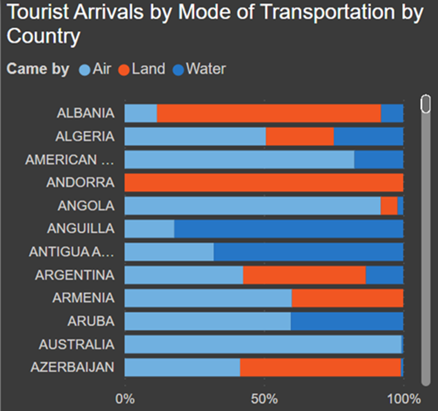
1. Tourist Arrivals by Mode of Transportation by Country:
The 100% stacked bar chart (Figure 11) provides a comprehensive view of tourist arrivals by mode of transportation, segmented by country. For instance, we can see that Angola primarily relies on air transportation for 91.94% of its arrivals, followed by air and water transportation. Andorra on the other hand, is only accessible via land, because the country can only be entered from Spain or France.
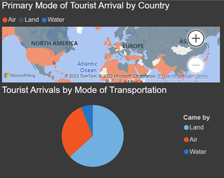
2. Primary Mode of Tourist Arrivals:
The following charts (Figure 12) offer valuable insights into the preferred modes of travel in different countries, which we further illustrate on the adjacent map. In the global landscape of tourist arrival modes, air and land transport are by far the primary choices for international tourists. In Europe, land travel between countries is relatively common due to well-developed road and rail networks. However, air travel is often the primary mode for tourists traveling from one continent to another. On the other end of the spectrum, water travel emerges as the least common method, with relatively fewer countries favoring it as the primary mode of arrival. However, the significance of water travel becomes more pronounced in nations with extensive coastlines or island territories, offering unique and scenic experiences for travelers. Examples include the Bahamas, the Cayman Islands, Barbados, etc.
It is important to highlight that specific nations serve as critical transit hubs for international tourists. Major international airports frequently act as primary gateways for air travel, while nearby countries tend to experience increased levels of land or water arrivals. For instance, the United States acts as a major gateway for both Canada and Mexico.
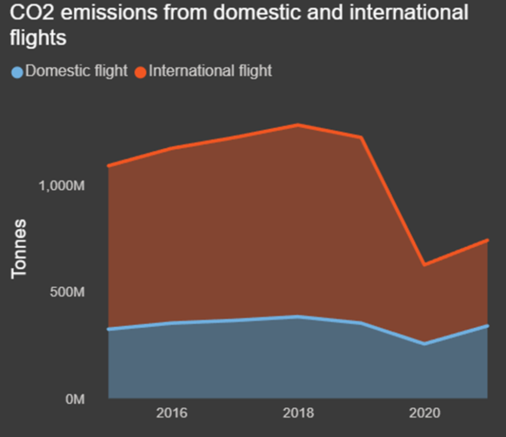
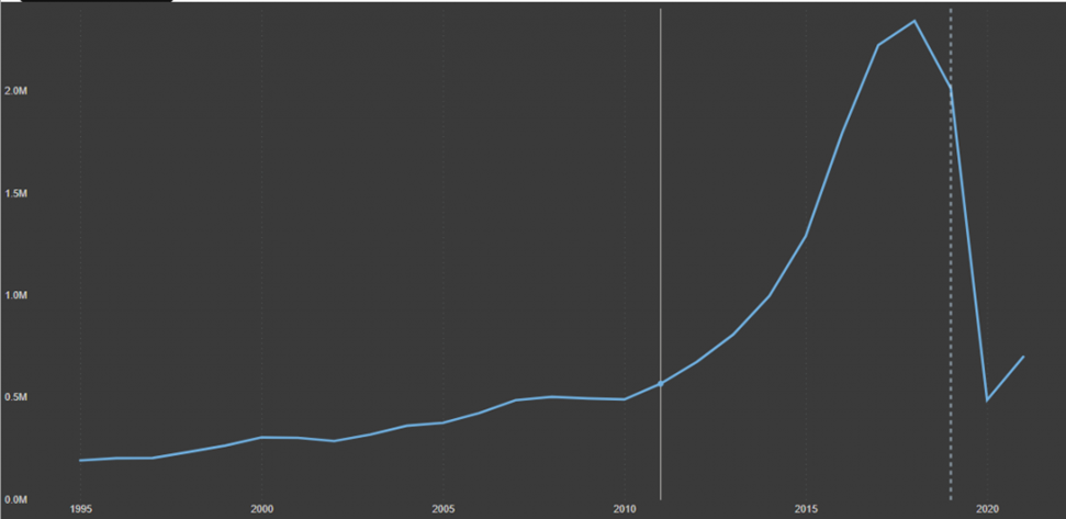
3. CO2 Emissions from Domestic and International Flights:
As we explore the realm of transportation, particularly emphasizing air travel, the provided visualization adopts a stacked area chart format. This visualization (Figure 13) presents the cumulative CO2 emissions stemming from both domestic and international flights. In 2018, the highest recorded CO2 emissions from flights reached a significant 1.28 billion tonnes, contrasting starkly with the lowest recorded emissions in 2020, which plummeted to 625 million tonnes. This dramatic reduction of approximately 50% in CO2 emissions after 2019 can be attributed to the impact of the COVID-19 pandemic, which emerged as an unintended environmental benefit, contributing to lower carbon footprints, and potentially mitigating the impact on the planet’s climate.
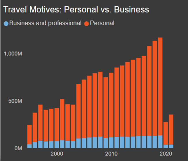
4. Travel Motives:
The stacked column chart in Figure 14 visually contrasts travel motives, distinguishing between personal (leisure, vacations, etc.) and business purposes. Notably, the average number of arrivals was significantly higher for Personal, surpassing Business by approximately 500 million. The most significant difference between Personal and Professional motives occurred in 2019, with Personal travel exceeding Business by roughly 900 million arrivals. This suggests that the tourism industry heavily relies on the revenue generated from personal travel, which might have higher peaks during vacation seasons. Additionally, the accelerated trends in remote work and virtual meetings, particularly evident in the drop in business travel following the pandemic, could indicate potential long-lasting implications for the future of business travel.
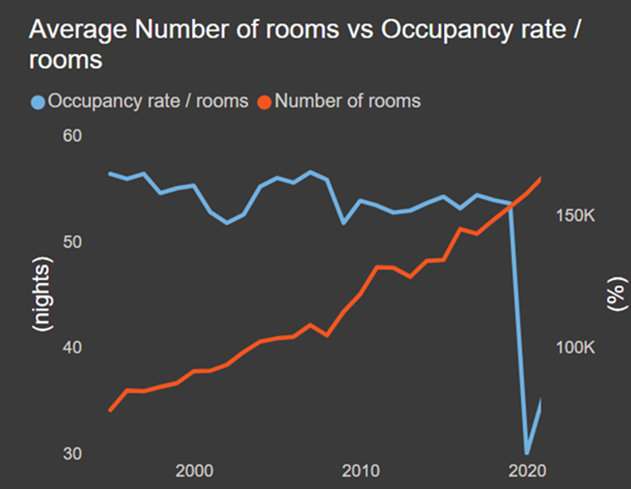
5. Accommodation: Average Number of Rooms vs. Occupancy/Room Over the Years:
The line chart (Figure 15) visually contrasts the average number of rooms available against the occupancy rate per room. Over the years, the average occupancy per room shows fluctuations, reflecting changes in tourism trends, seasonality, economic conditions, and other factors that influence room bookings. The increase in room availability can be linked to various factors, such as new accommodation entering the market and existing ones maintaining their room inventory. However, a striking drop of approximately 45% in room occupancy is indicative of the pandemic, significantly reducing travel demand. This contrast underscores the adaptability and resilience of the hospitality industry in the face of unforeseen disruptions.
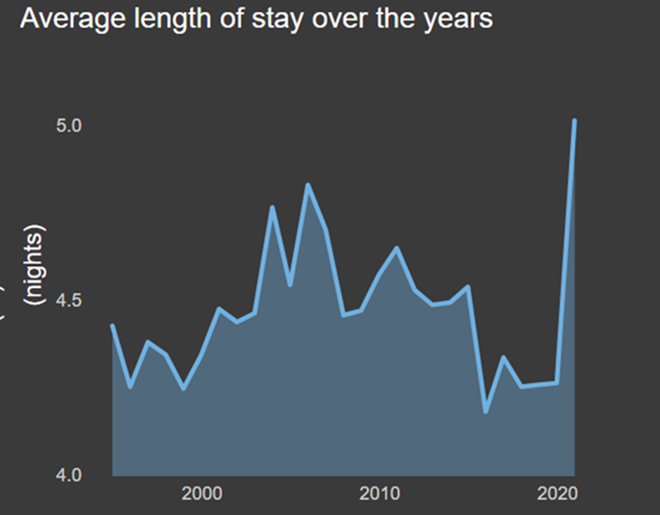
6. Average Length of Stay:
The next area chart (Figure 16) unveils the evolution of the average length of stay in hotels and similar establishments. Notably, 2021 stands out as a year with the highest average length of stay, marking a substantial increase compared to previous years. This remarkable shift is likely a consequence of COVID-19. Travelers, in response to the pandemic, may have opted for longer stays due to various factors, including travel restrictions, health concerns, and most importantly, hotel quarantines.
Tourism’s Economic Footprint
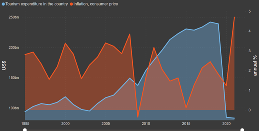
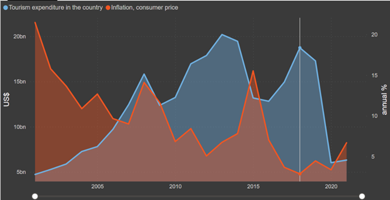
1. Comparing Tourism Spending and Inflation:
The first area chart (Figure 17) provides a comprehensive overview of tourism expenditure and inflation over a 27-year period. Notably, the year 2019 emerges as a standout, with tourism expenditure reaching $9.22 billion. However, the lowest point recorded in 2020 stood at $3.49 billion, marking a substantial 62% decrease. While tourism expenditure has been steadily rising, it shows a distinct drop in this particular year, which can also be attributed to the impact of the COVID-19 pandemic on the tourism industry. Travel restrictions and lockdowns led to a sudden decline in tourism expenditure, which is evident in the chart.
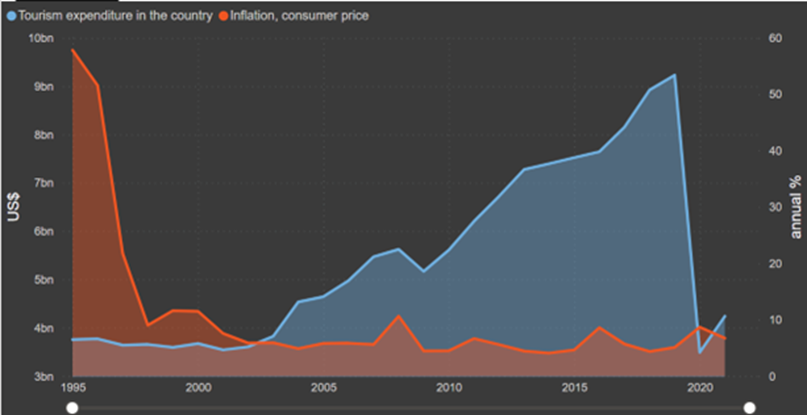
In addition, we can see a decreasing trend in inflation, which suggests a slowing rate of price increases for goods and services. It’s essential to note that the chart’s overview reflects the broader trend of inflation. Inflation rates can vary from country to country due to numerous factors, including economic policies, global conditions, and specific circumstances. For instance, when we zoom in on the US (Figure 18), we can clearly see a fluctuating inflation line, notably going from 3.84% to -0.36% in 2009. One noteworthy point is the decline in tourism expenditure after the events of 9/11 in 2001.
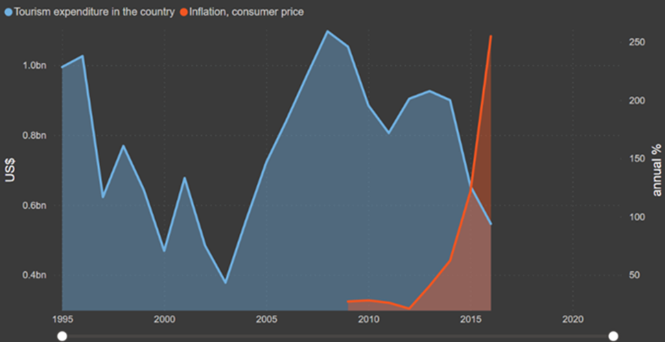
It’s important to mention that in some cases, there may be an inverse relationship between inflation and tourism expenditures. Higher inflation can lead to increased costs for goods and services, including those related to tourism (such as accommodation and dining). This can potentially deter tourists, leading to decreased expenditure. An example of that is Venezuela (Figure 19).
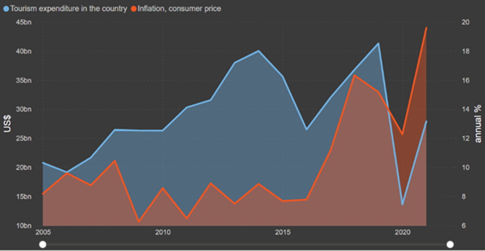
However, in other cases, exchange rates can play a significant role. If a country’s currency is depreciating due to inflation, it can make the destination more attractive to foreign tourists, as their own currency has greater purchasing power. One example of this scenario is Turkey (Figure 20). After 2020, the depreciation of the Turkish lira against major foreign currencies made the country more appealing to international tourists, resulting in an increase in tourism expenditures.
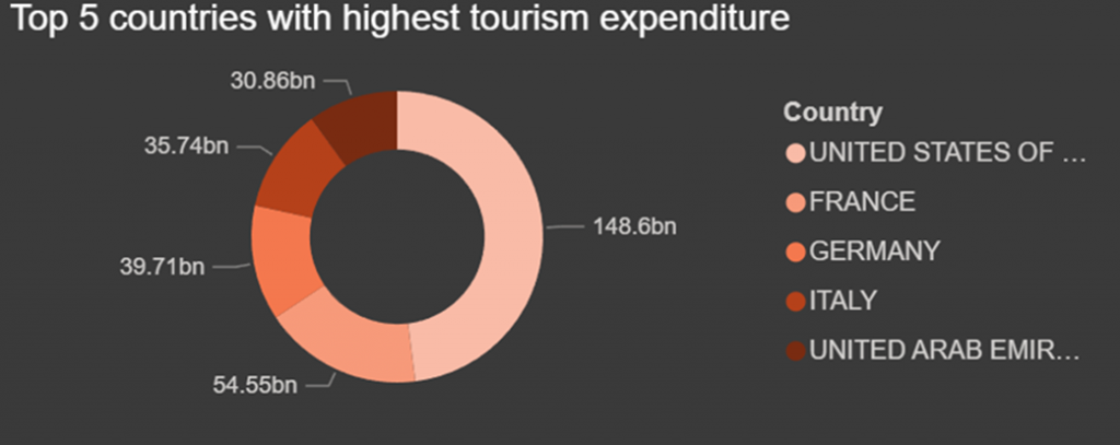
2. Top 5 countries with the highest tourist expenditures:
The following chart in Figure 21 is a donut chart that provides a clear snapshot of the top 5 countries with the highest tourism expenditure. The chart’s central position is occupied by the United States of America, indicating its status as the global leader in tourism expenditure. This reinforces the country’s prominence as a tourist destination and its substantial economic contribution to the tourism industry. Following the USA, the chart highlights four major countries—France, Germany, Italy, and the UAE, which reflects their strong appeal to travelers and their economic significance in the global tourism landscape.
3. Tourism’s Economic Contribution:
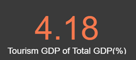
The metric (Figure 22) reveals the proportion of tourism GDP as a percentage of the total GDP, offering a swift overview of the current (most recent) significance of tourism within the country’s economic framework. The global average hovers around 4.18%, signifying the worldwide impact of tourism on diverse economies. By comparing the country’s percentage to this global average, we establish a benchmark for assessing its reliance on tourism as an economic driver. A percentage considerably exceeding the global average implies a substantial dependence on tourism, whereas a lower percentage suggests a more diversified economic structure.
4. Tourism GDP % by Country:
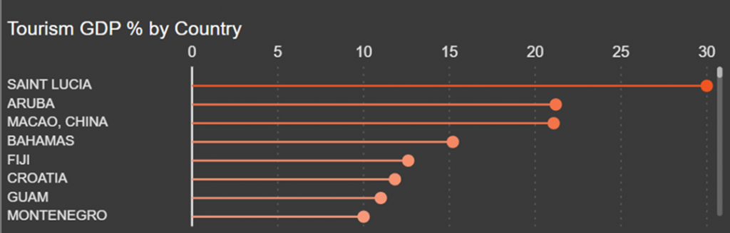
The lollipop chart below (Figure 23) offers a comparative view of tourism’s contribution to the economy of different countries. Each bar represents a country, and the height of the bar reflects the percentage of the country’s GDP attributed to tourism. We can see that Saint Lucia has the highest Tourism GDP (%) at 30, followed by Aruba and Macao, China. Mongolia has the lowest Tourism GDP (%) at 0.04. It’s essential to note that the GDP figures presented here are the most recent available.
5. Tourism GDP % by Year:
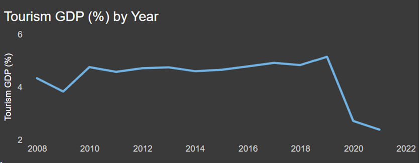
The line chart (Figure 24) tracks the evolution of Tourism GDP as a percentage of total GDP over the years. Notably, the year 2019 stands out as a pivotal point in the chart. During this year, the Tourism GDP reached its highest point at 5.15% of the total GDP. This represents a substantial economic contribution by the tourism sector, reflecting robust growth and potentially a peak in international travel. However, in 2021, it sharply declined to its lowest point at 2.38%, primarily due to the profound impact of the COVID-19 pandemic on global tourism.
6. Employment by Sector Radar Chart:
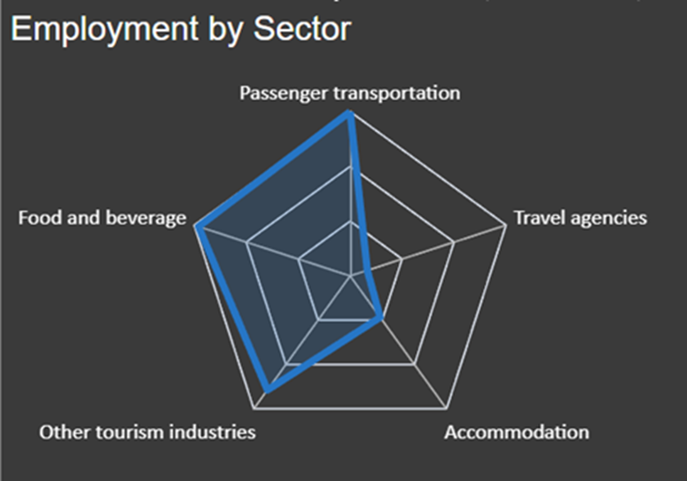
The radar plot (Figure 25) visually represents employment across key sectors of the tourism industry. It is revealed that « passenger transportation » and « food and beverage » are the leading employers within the tourism industry, showcasing their near-equal contribution to the workforce. Additionally, « other tourism industries,” including cultural attractions, recreational activities, and entertainment, represent a significant portion of the workforce. « Accommodation » and « travel agencies » complete the radar, indicating their respective roles in the industry, though to a relatively lesser extent.
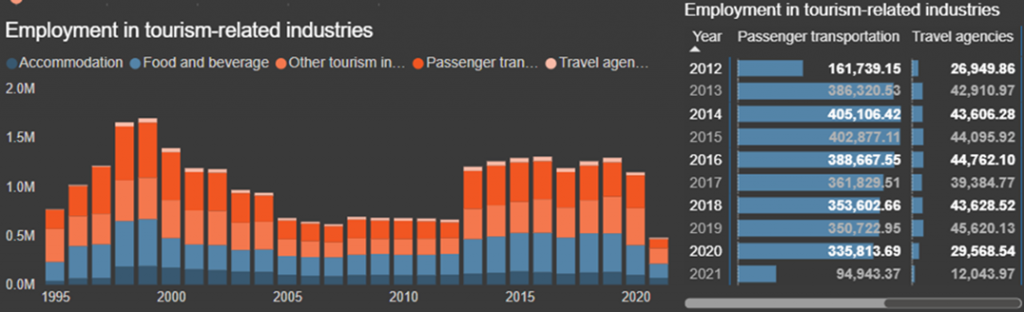
7. Employment in Tourism-Related Industries:
The stacked bar chart (Figure 26) offers a dynamic view of employment distribution across diverse tourism-related industries over the years. Indeed, passenger transportation and food and beverage sectors consistently lead in employment. A noteworthy trend is the decline in employment within travel agencies, dropping from approximately 44K before the onset of the COVID-19 pandemic to 12.04K in 2021. This decline is likely influenced by the increasing preference for online booking services, which have diminished the demand for traditional travel agency assistance, resulting in a reduced workforce requirement in this sector. The passenger transportation industry experienced a significant decrease in employment as well, reflecting the broader impact of the pandemic on the tourism sector. For a more detailed view, the values are better highlighted in the accompanying table.
Quick Zoom in on LEBANON
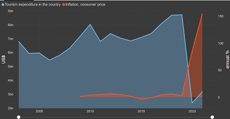
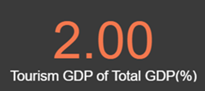
In 2019, Lebanon saw the onset of inflation following the Lebanese revolution, which had a significant impact on the country’s economic landscape (Figure 27). This situation worsened in 2020 when the COVID-19 pandemic led to a substantial drop in tourist expenditures, affecting the tourism industry. However, in 2021, there was a notable resurgence in tourist spending as Lebanon became an attractive destination. This increase was driven by the advantageous exchange rates and lower prices, making it a cost-effective choice for travelers. Furthermore, in the backdrop of Lebanon’s post-revolution crisis and the subsequent post-pandemic era, there has been a noticeable influx of returning diaspora members, including family members and students. This resurgence has significantly influenced the increased arrival rates since 2020, subsequently contributing to elevated expenditures. Notably, the tourism sector contributed around 2% to the overall GDP (Figure 28).
Some Highlights:
1. Russia hosting the World Cup in 2018 boosting tourist spending (Figure 29):
2. The UAE‘s ever-increasing tourist arrivals making it a prime destination (as they plan to reach 25 million tourists in 2025) (Figure 30):
3. The filming of the « Game of Thrones » series in Iceland generating interest in visiting filming locations after it premiered in 2011 (Figure 31):
4. The devastating earthquake in Nepal in 2015 disrupting tourism (Figure 32):
5. The end of the civil conflict in Sri Lanka in 2009 fueling a sharp increase in tourist arrivals (Figure 33):
Conclusion
In summary, our examination of the global tourism landscape through our dashboard has offered a nuanced perspective on an industry in a perpetual state of change. From the peak of international travel to the profound impacts of the COVID-19 pandemic, it highlights the tourism sector’s inherent ability to adapt and endure.
Looking forward, the growing accessibility of data and ongoing technological advancements make it clear that data analytics will play an even more pivotal role in shaping the future of the tourism sector. It offers invaluable insights into consumer behavior, demand projection, revenue management, and decision-making. Contemplating the potential of AI and data analytics in travel, one can’t help but envision the exciting opportunities that lie ahead.
References
- https://www.unwto.org/tourism-statistics/key-tourism-statistics
- https://www.unwto.org/tourism-statistics/economic-contribution-SDG
- https://data.worldbank.org/indicator/FP.CPI.TOTL.ZG?locations=LB&most_recent_value_desc=false&view=chart
- https://stats.oecd.org/Index.aspx?DataSetCode=AIRTRANS_CO2#
- https://www.kaggle.com/datasets/simonaasm/world-happiness-index-by-reports-2013-2023/

Your blog on tourism is truly captivating! It’s commendable how you delve into the realistic trends and seasonal influences that shape travel experiences in different countries. Your insights make it much easier for travelers to plan their adventures and explore the world in a way that aligns with their interests. Thank you for providing such valuable information and making the world of tourism more accessible to all of us!
Your blog post beautifully captures the intricate layers of the travel industry, unraveling the stories hidden beneath glossy brochures and captivating Instagram snapshots. The comprehensive analysis provided through the dynamic dashboard sheds light on various crucial aspects, ranging from tourist arrivals to economic contributions, unveiling fascinating insights into the evolving trends and patterns within the global tourism landscape. The incorporation of specific case studies, such as the exploration of Lebanon’s tourism dynamics, adds a personal touch to the narrative, underscoring the significance of contextual understanding in comprehending the industry’s complexities.